
Who This Is For: This guide is for homeowners who like the warmth of gold pendant lights but worry they may look too shiny, too formal, or out of place in a real kitchen, dining room, bedroom, or living area.

Quick Answer
Gold pendant lights look elegant, not flashy, when the finish is softened, the scale is controlled, and the surrounding room gives the metal some quiet contrast. In most homes, that means choosing brushed brass, champagne gold, antique gold, or a warm painted gold rather than a mirror-polished yellow finish. Pair the fixture with matte surfaces, natural wood, stone, linen, black accents, or soft white walls. Then use warm white bulbs, thoughtful hanging height, and simple surrounding decor so the gold reads as warmth rather than glare.
The trick is to treat gold as a finish, not a decoration theme. A well-chosen Gold Pendant Light can make a kitchen or dining room feel finished, but too many shiny details nearby can make the same fixture feel busy. One gold pendant over a breakfast nook, two over an island, or a simple linear gold fixture over a table often feels more refined than filling the entire room with matching gold hardware, gold frames, gold chairs, and gold accessories.
Why Gold Pendant Lights Sometimes Look Flashy
Gold is naturally reflective, so it responds strongly to light, shadow, and nearby color. A black pendant can usually sit quietly because it absorbs light. A white pendant can blend into ceilings and cabinets. Gold, however, bounces warm highlights back into the room. That is why one gold fixture can make a space feel rich, but the wrong finish or placement can quickly feel too bright.
There are three common reasons gold pendant lights look flashy. First, the finish is too yellow and glossy. Second, the fixture is too large for the room or hung where it dominates sightlines. Third, the room around it has too many competing reflective surfaces, such as polished tile, glossy counters, mirrored decor, or high-shine cabinet hardware. None of those choices are automatically wrong, but they require more restraint.

Let The Gold Have Breathing Room
A gold pendant feels expensive when it has contrast around it. Matte cabinetry, quiet wall colors, and simple furniture let the fixture stand out without making the whole room feel like a showroom. If everything nearby is also shiny, the eye has nowhere to rest.
Choose The Right Gold Finish First
The finish matters more than most people expect. Two gold pendant lights can have the same shape but create very different moods depending on the surface. Brushed brass feels warmer and more lived-in. Champagne gold feels lighter and more modern. Antique brass or aged gold works well in traditional, transitional, and vintage-inspired rooms. Highly polished gold feels glamorous, but it needs a simpler background to avoid looking loud.
If your room already has brushed nickel, stainless steel appliances, or black cabinet pulls, do not panic. Gold does not need every metal in the room to match. In fact, mixed metals often make gold look more natural. The best rule is to repeat gold once or twice in small ways, such as a cabinet pull, a picture frame, or a faucet detail, but not everywhere.
| Gold Finish | Best Room Feeling | How To Keep It Elegant |
|---|---|---|
| Brushed Brass | Warm, timeless, relaxed | Pair with wood, stone, cream, and soft black accents. |
| Champagne Gold | Light, modern, airy | Use with pale cabinets, glass, linen, and clean silhouettes. |
| Antique Gold | Collected, vintage, softer | Let it work with aged wood, marble, ceramic, or muted wall colors. |
| Polished Gold | Glamorous, formal, dramatic | Use sparingly and keep the surrounding finishes quiet. |
Match Gold Pendant Lights With The Room Palette
A gold pendant light usually looks best when the room palette has at least one warm or grounding element. White cabinets can work beautifully, but the room should not feel icy. Add wood stools, a warm rug, cream walls, beige stone, muted green, taupe, or leather seating. Gold needs something warm to talk to.
For kitchens, gold pendants are especially useful when the room has white, black, gray, walnut, or navy cabinets. For dining rooms, gold can lift a dark wood table or soften a room with neutral upholstery. In living spaces, a gold pendant works better when it is not competing with too many decorative finishes. Think of it as the warm note in the room, not the only story.
If you are still comparing shape, size, and room placement, start with the broader Pendant Lighting collection before narrowing down to finish. A gold finish should be the final layer after you know whether the space needs a globe, cone, drum, linear, glass, or sculptural form.
Use Black Or Wood To Ground Gold
Gold feels more grown-up when it is grounded by darker or more textured materials. Black hardware, walnut stools, woven shades, stone counters, or a dark dining table can keep the finish from floating visually.

Use Size And Placement To Keep The Look Refined
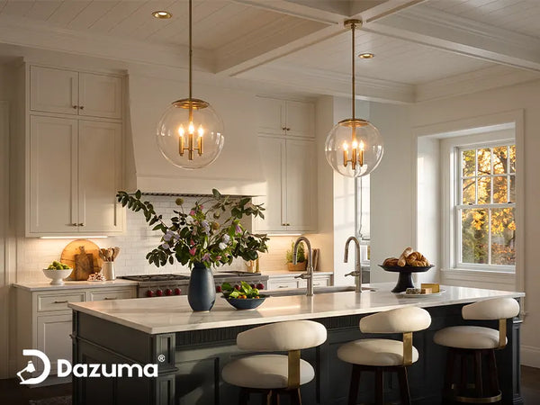
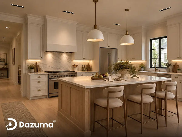
Gold gets more attention than matte black or white, so fixture size matters. A pendant that is slightly too large in gold will feel much more noticeable than the same shape in a quiet finish. Over a kitchen island, leave enough negative space between fixtures and keep the bottom of the pendant high enough to protect sightlines. For many homes, 30 to 36 inches above the counter is a useful starting point, but the fixture size, ceiling height, and eye level matter too.
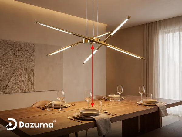
Over a dining table, the pendant should feel connected to the table but not heavy above it. A good visual test is to sit at the table and look across. If the gold fixture blocks faces or feels like it is crowding the table, raise it or choose a slimmer shape. For more detailed spacing logic, the blog The Golden Rules Of Pendant Lighting: Sizing & Placement is a helpful reference when you are deciding how many pendants to use and how far apart they should be.
Gold pendants also benefit from visual repetition. If one large fixture feels too bold, two or three smaller pieces may look more balanced. If three shiny pendants feel busy, a single linear fixture may be calmer. Elegant lighting often comes from proportion, not from the most expensive finish.

Recommended Style For Soft Modern Rooms
If your goal is a warm modern look rather than a traditional brass-lantern effect, a sculptural gold LED pendant can be easier to style. The softer shape helps the finish feel intentional and artistic, while the slim profile keeps the gold from looking heavy.
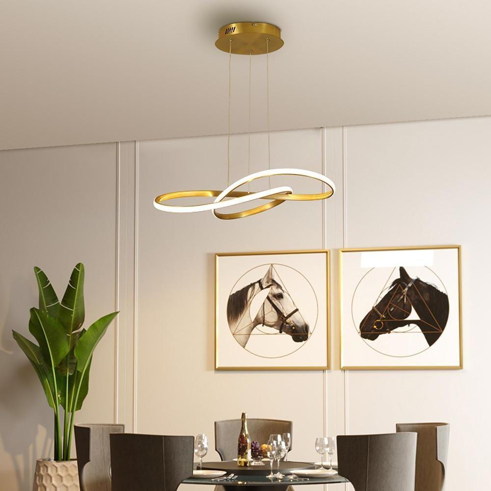
Interweaved Wave LED Gold Modern Hanging Lamp Island Lights Pendant Light
Price: $263.99
Best for kitchen islands, dining rooms, and living areas where you want a gold pendant to feel fluid, warm, and modern instead of ornate.
- The wavy shape makes the gold finish feel sculptural rather than flashy.
- The low-profile form works well over islands and dining areas.
- Integrated LED lighting keeps the design clean and contemporary.
Use Bulb Color To Control The Mood
Color temperature can make or break gold lighting. Warm white light usually makes gold feel cozy, soft, and flattering. Cooler light can make a gold finish look sharper and more reflective, which may be useful in a crisp modern room but can feel harsh in a dining or bedroom setting.
For most kitchens and dining rooms, 2700K to 3000K is the safest range for elegance. It brings out the warmth in brass, wood, stone, and skin tones. If the pendant uses integrated LED, choose the warmer option if the room is meant for eating, gathering, or evening atmosphere. If the fixture allows bulbs, pick dimmable LED bulbs when the switch and fixture are compatible, because dimming is one of the easiest ways to make gold look less flashy at night.
There is one design detail homeowners often miss: gold finishes can visually intensify warm light. That is wonderful when the room needs softness, but it can make a small space feel amber if the bulbs are too warm or too bright. If your walls are cream, beige, or warm wood, test the bulb before buying a full set. The article Pendant Light Colors for Kitchens and Living Spaces also explains how fixture color changes the mood of the room.
| Design Choice | Elegant Effect | Flashy Risk |
|---|---|---|
| Warm White Light | Softens gold and flatters dining areas. | Can feel too yellow if the room is already very warm. |
| Large Gold Fixture | Creates a confident focal point. | Can overpower a small kitchen or low ceiling. |
| Glass Or Crystal Detail | Adds sparkle in controlled amounts. | Can look too busy beside glossy surfaces. |
| Muted Room Palette | Lets the gold read as warmth and contrast. | May look flat if there is no texture or depth. |

Think About The Light, Not Just The Metal
A gold fixture in daylight may look subtle, then feel much brighter after dark. Choose bulbs and dimming controls with nighttime use in mind, especially for dining rooms, bedrooms, and open living areas.
Recommended Style For Small Sparkle
If you like a little shine but do not want the room to feel overly decorative, use sparkle in a smaller dose. A mini crystal pendant in a gold finish can work well over a small dining nook, bar counter, bedside area, or hallway when the rest of the room stays simple.
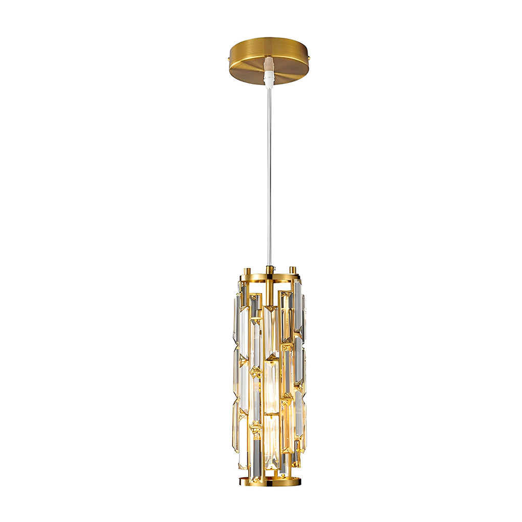
Mini Crystal Pendant Light Creative Art Crystal Island Ceiling Light
Price: $102.99
Best for smaller areas where you want a gold pendant with sparkle, but the fixture still needs to stay compact and controlled.
- The compact size makes the gold finish easier to control.
- Crystal glass adds light play without requiring a large chandelier.
- The E27 socket allows flexible bulb selection for mood and brightness.
Common Mistakes That Make Gold Look Too Loud
Using Too Many Matching Gold Pieces
Matching every finish can make a room feel flat and overly decorated. A gold pendant does not require gold stools, gold cabinet knobs, gold mirror frames, and gold table legs. Repeat the finish lightly, then let other materials balance it.
Choosing A Fixture That Is Too Ornate For The Room
Gold already has visual presence, so an ornate shape may feel heavier than expected. If your room has detailed tile, veined stone, patterned wallpaper, or dramatic cabinet color, a simpler pendant shape usually looks more expensive.
Ignoring Shade Shape
Shade shape controls how the gold reads. A metal cone feels focused and architectural. A globe feels softer. A glass shade feels lighter. A fabric or Drum Pendant Lighting style can calm the shine by introducing a larger matte surface around the light. The metal finish is only one part of the visual equation.
Using Only Overhead Light
A gold pendant can look harsh when it is the only light source in the room. Add under-cabinet lighting, wall sconces, table lamps, or soft accent lighting so the pendant is part of a layered plan. This is especially important in open layouts where the pendant is visible from the living room.
Modern Gold Works Best With Simple Lines
If you prefer a cleaner home style, look for slim silhouettes, integrated LED lines, simple globes, or quiet mixed materials. The Modern Pendant Lights category is useful when you want gold to feel current rather than ornate.
Final Advice
The most elegant gold pendant lights do not scream for attention. They warm up the room, add a little polish, and help the space feel designed. Start with the room first: cabinet color, wall tone, table shape, ceiling height, and natural light. Then choose a gold finish that supports those elements.
If the room is small, choose a slimmer or smaller pendant. If the room is modern, keep the silhouette simple. If the room already has sparkle, choose satin or brushed gold instead of polished metal. If the space feels flat, a gold pendant can be exactly the warm focal point it needs. The difference between elegant and flashy is rarely the color alone; it is the relationship between finish, scale, light temperature, and everything around it.