
Who This Is For: This guide is for homeowners who like black and gold chandeliers but worry the combination may feel flashy, too formal, or disconnected from the room. It is especially useful if you are choosing fixtures early in a dining room, living room, bedroom, or entry remodel.
Quick Answer: Let One Color Lead and the Other Support
Black and gold looks elegant when the two finishes do different jobs. Black should usually provide the outline, weight, or architectural structure; gold should catch the eye in smaller moments. When every surface is equally dark, reflective, and decorative, the room starts to feel busy. When the chandelier has a clear hierarchy, it reads as intentional.
A reliable starting point is to make black the dominant finish and gold the accent. That often looks like a matte black frame with gold joints, sleeves, or interior details. A gold-forward chandelier can work beautifully, but the room then needs quieter black anchors and fewer competing metallic objects.
The real issue is not whether gold is “too much.” It is the combined visual load of the fixture: its size, number of arms or ornaments, reflectivity, bulb brightness, and how many other statement pieces are nearby. Control those variables and even a dramatic chandelier can feel calm.

Build the Room Around a Visual Hierarchy, Not a Matching Set
One of the easiest ways to overdo this palette is to treat “black and gold” as a shopping instruction for the entire room. Homeowners find a chandelier they love, then add a black-and-gold mirror, black-and-gold side tables, gold-framed art, gold lamps, and black hardware. Each piece may be attractive alone, yet together they flatten the room because everything asks for the same level of attention.

Choose One Primary Statement
If the chandelier has an energetic radial shape, layered leaves, or a large reflective surface, let it be the room's main jewelry. Keep the coffee table, curtain hardware, and accessories simpler. A quiet wool rug, natural wood, linen upholstery, or plaster-toned walls give the metal finishes somewhere to breathe.
Start by exploring the range of Black And Gold Chandelier designs, then judge each silhouette against the visual activity already present in your room.
Use Black as the Outline and Gold as the Light Catcher
Matte black visually recedes and gives a fixture definition. Gold advances because it reflects warm light and attracts the eye. That makes a black frame with smaller gold connections especially forgiving: you see the overall silhouette first, then notice the warmer details. If you prefer a more decorative gold chandelier, reverse the strategy in the room by using black in larger, simpler shapes such as a console, window frame, dining chair, or artwork frame.
If you are still deciding which finish should lead, the earlier guide to Black vs Gold Chandeliers: Which Style Fits Your Home? can help you evaluate the room's existing undertones before choosing a fixture.
| What the Room Already Has | Best Chandelier Direction | What to Edit Back |
|---|---|---|
| Black windows, dark cabinetry, or charcoal furniture | Gold-forward or evenly balanced black and gold | Extra dark accessories that make the room feel heavy |
| Warm oak, cream upholstery, and soft neutral walls | Black-dominant fixture with restrained warm-gold details | Too many yellow-gold accents competing with the wood |
| Marble, mirrored furniture, velvet, or bold wallpaper | Simple silhouette with a matte or brushed finish | More crystal, mirror, and highly polished metal |
| Minimal white room with few architectural details | Sculptural black-and-gold focal point | Tiny matching accents scattered around the room |
Scale Is What Makes a Bold Chandelier Feel Composed
A fixture that is too small can look oddly decorative because it reads like an accessory floating in the room. A fixture that is too large can overwhelm the ceiling before you even notice its finishes. Proper scale allows black and gold to feel architectural rather than ornamental.
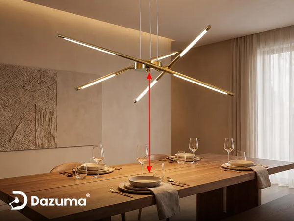
For a dining table, a chandelier approximately one-half to two-thirds the table's width is a useful starting range. With an 8-foot ceiling, the bottom commonly hangs about 30 to 36 inches above the tabletop; add roughly 3 inches for each additional foot of ceiling height, then adjust for the fixture's body and seated sightlines. In an open area, adding the room's length and width in feet gives a rough starting diameter in inches—not an absolute rule.
Always check the actual diameter, height, canopy, suspension length, and weight before ordering. A 40-inch Sputnik can feel airy because of the open spaces between its arms, while a dense 31-inch leaf chandelier may carry more visual weight. Dimensions alone do not describe presence.
A Black-Dominant Sputnik for Controlled Contrast
This radial design demonstrates the easier version of the palette: matte black establishes the silhouette, while gold-toned joints add smaller points of warmth. The open arms keep the fixture visually lighter than a solid drum or heavily ornamented chandelier of the same width. It can work in a living room or dining area where you want movement without adding another dense surface.
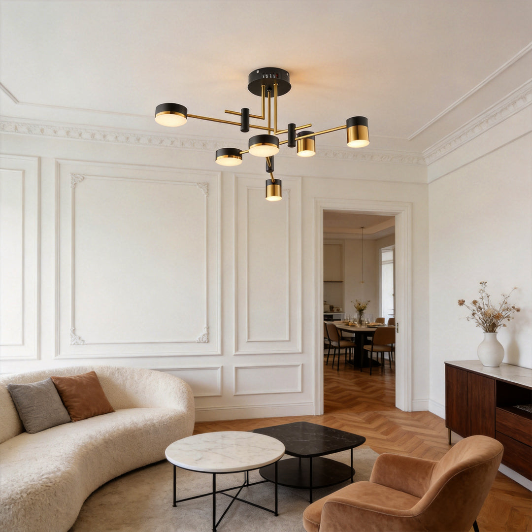
Black and Gold Sputnik Ceiling Light Geometric Radial Light
Price: $229.99
A strong fit for modern rooms that need a defined black silhouette, limited gold accents, and an open shape that does not visually close in the ceiling.
- Matte black iron arms keep the gold accents visually controlled.
- Acrylic shades diffuse the light instead of exposing multiple harsh points.
- Several sizes and light counts help match the fixture to the room's scale.
Control note: The 3-color option changes color temperature only; choose the remote-dimmable option if you also want brightness control.
If you like this airy mid-century geometry, compare it with other Sputnik Chandelier silhouettes. Our Ultimate Guide to Sputnik Chandeliers also explains how arm count and proportion change the fixture's presence.
Repeat the Finishes Enough to Connect—Then Stop
A chandelier should not be the only black or gold object in the room, but the supporting repetition can be subtle. Two or three echoes are usually enough: perhaps black curtain rods, a thin black picture frame, and one warm metal bowl or lamp base. They do not need to be evenly spaced, and they do not need to match the chandelier perfectly.
Use a Three-Point Repeat, Not a Complete Metal Package
Imagine a loose triangle around the room. The chandelier is one point; a small metal detail at eye level is the second; another farther away is the third. This creates continuity without turning the finish into a motif. Keep large furniture and textiles mostly outside that repetition.

A third metal is also fine. Stainless appliances, nickel plumbing, or an antique bronze piece does not have to be replaced. Repeat a visually prominent secondary metal once, and keep the undertones reasonably compatible. A collected room usually feels more sophisticated than an exact matching set.
Choose the Right Shine Level for the Mood You Want
Finish texture changes the intensity of black and gold. Matte black absorbs light and appears quieter. Satin, brushed, or leafed gold reflects in broken highlights, which feels softer than mirror-polished brass. Highly polished gold needs more restraint elsewhere because every bulb and window creates another bright reflection.
Before choosing a chandelier, look at the room in daylight and at night. Warm oak, cream, terracotta, and beige often support warmer gold easily. Cool gray, blue-white stone, or bluish daylight may make a yellow gold appear more pronounced. In that setting, champagne, antique, or muted gold can bridge the undertones more gently.
A Gold-Forward Chandelier That Needs Quiet Black Anchors
This leaf-inspired fixture is deliberately more decorative. Its layered metal form and circular profile create a strong focal point, so I would pair the gold version with simple black dining chairs, a dark art frame, or a slim black console rather than adding more ornate metallic furniture. The room should supply the black boundary while the chandelier carries most of the gold.
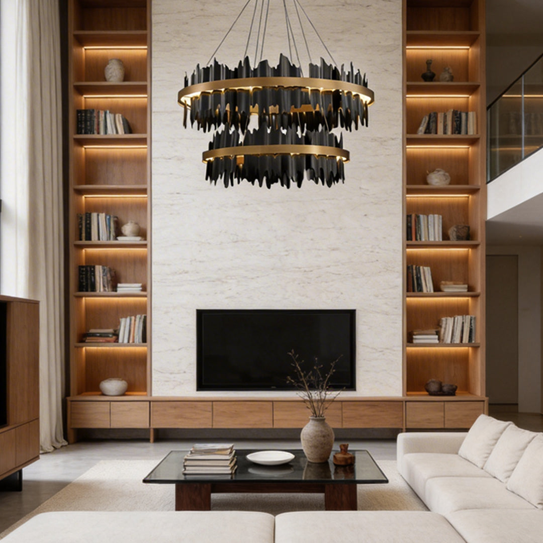
Gold Leaf Chandelier Modern Creative Metal Round LED Ceiling Light
Price: $1,064.99
A more expressive focal point for a living or dining room where the surrounding furniture is simple enough to let the layered leaf form stand on its own.
- Layered metal leaves create texture without relying on crystal ornament.
- Acrylic diffusion softens the integrated LED output across the circular form.
- Brightness and color temperature can be adjusted for daytime or evening use.
The listed versions weigh about 19.84 to 33.07 pounds, so confirm the ceiling box, support, and installer requirements for your selected size.
Gold-forward fixtures sit naturally among Gold Chandelier designs, but the most elegant result comes from evaluating the finish alongside the room's black elements, not in isolation.
Room-by-Room: Where Black and Gold Looks Most Natural

Dining Room: Use the Table as the Visual Anchor
The table gives a chandelier a clear boundary, which makes a bold finish easier to control. Center the fixture over the table rather than the room if the table is intentionally off-center. Repeat gold once on the table or sideboard, then let plates, linens, and wood provide a softer counterpoint.
Living Room: Coordinate With the Seating Group, Not Every Wall
In a living room, judge the chandelier against the rug and seating arrangement. An open Sputnik can span a broad conversation area without feeling solid overhead. A dense sculptural fixture works best when the upholstery and art are quieter. Avoid grouping it with a gilded mirror, reflective table, and high-contrast rug unless you want a maximalist room.
Bedroom: Lower the Contrast and the Brightness
Bedrooms usually benefit from the gentler version of black and gold: a smaller fixture, more matte surfaces, warm bedding, and lower evening light. Carry black into a thin bed frame or lamp base instead of a full glossy furniture suite. If the fixture uses integrated LED, confirm that brightness can be reduced independently; color-temperature adjustment alone will not create the same restful effect.
Entry or Foyer: Let Architecture Set the Limit
An entry can support more drama, but door swing, stairs, upper-floor sightlines, and walking clearance matter. View the chandelier from the front door and from above in a two-story foyer. For open areas, keep at least about 7 feet of clearance below unless the manufacturer or local requirements call for more.
Across all these spaces, the best Modern Chandeliers are not simply the newest-looking ones. They are the fixtures whose shape, scale, finish, and light quality solve the room you actually have.
Warm, Dimmable Light Is Part of the Color Palette
A black-and-gold chandelier changes after sunset. In cool, bright light, gold can look sharper and more yellow, while black appears harder at the edges. Around 2700K to 3000K, gold usually reads warmer and more relaxed. That does not mean every room must stay at 3000K all day, but it is a strong evening starting point for dining and living spaces.
Test the Fixture at Evening Brightness
Do not judge the finish only under showroom-level output. Dim the chandelier to the level you would use during dinner or while watching television. If the gold still glows gently and the black silhouette remains readable, the room will feel layered. If all you see are hot reflections, reduce brightness and add softer light from lamps or sconces.

Layered lighting also keeps the chandelier from doing every job. Use it for ambient light and visual focus, then add task light near reading chairs, a buffet, or artwork. When the chandelier is the only source, homeowners often run it too brightly, which exaggerates the gold and flattens the room.
Five Common Mistakes That Make the Look Feel Overdone
- Buying every accessory in black and gold. Repeat the palette a few times, then bring in wood, stone, ceramic, linen, and other nonmetallic textures.
- Choosing the fixture before measuring. A beautiful finish cannot rescue a chandelier that blocks sightlines or looks undersized over the table.
- Combining too many reflective surfaces. Mirror, polished brass, crystal, glossy lacquer, and metallic wallpaper can multiply the visual brightness.
- Using cool light at full output all evening. Gold often feels more refined under warmer, dimmer light with support from other sources.
- Trying to match every metal exactly. Controlled variation creates depth; perfect matching can make a room feel staged.
A Buying Checklist Before You Commit
- Photograph the room in daylight and at night. Existing undertones and reflective surfaces become easier to see in a photo.
- Measure the room, table, ceiling height, and suspension zone. Confirm both visual proportion and physical clearance.
- Compare visual density, not diameter alone. Open radial arms and layered metal leaves of the same width will not feel equally heavy.
- Decide which finish leads. If the chandelier is gold-forward, identify the simple black anchors that will connect it to the room.
- Check the exact finish sample or close-up. “Gold” may mean warm yellow, champagne, antique, brushed, or highly polished.
- Confirm dimming behavior. Color-temperature switching and brightness dimming are separate functions.
- Verify fixture weight and ceiling support. Larger layered fixtures may require more than a standard light-duty box.
- Remove one competing statement piece. Edit before adding; it is often the fastest route to elegance.
Final Advice: Aim for Tension, Not Perfect Matching
The appeal of black and gold comes from contrast. Black gives the room structure; gold brings warmth and catches light. You do not need to soften that tension until the palette becomes bland. You only need to control where the contrast appears.
Choose one chandelier with the right scale and visual density. Let either black or gold lead. Repeat the finishes two or three times in smaller ways, surround them with natural textures, and use warm dimmable light in the evening. Most importantly, leave enough quiet space around the fixture for its silhouette to register.
When a black and gold chandelier feels overdone, the solution is rarely to remove all the gold. More often, it is to reduce competing shine, correct the scale, or simplify nearby decor. Get those decisions right, and the fixture will look confident and enduring rather than flashy.