
Who This Is For: This guide is for homeowners choosing black and gold pendant lights for a kitchen island, breakfast table, or open dining area who are worried the fixtures may feel too dark, too formal, or difficult to coordinate with cabinets, countertops, and existing hardware.
Black and Gold Works Best When the Kitchen Gives Each Finish a Job
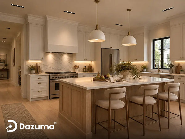
Black outlines a fixture and connects to windows, faucets, stools, or dark appliances. Gold reflects light and relates naturally to wood, warm stone, brass hardware, and cream surfaces.
Problems begin when every detail is forced to match. Instead, decide which finish should carry the visual weight. Pale kitchens often need more black structure; dark kitchens usually need more visible gold. The right result comes from contrast, undertone, material, and proportion.

Quick Answer: Which Kitchen Colors Work Best?
Black and gold pendant lights work especially well with:
- Warm white and cream cabinets: crisp black outlines with soft gold warmth.
- White oak and natural wood: black prevents the room from becoming too beige, while gold connects to the grain.
- Walnut and medium-dark wood: gold complements the wood; black creates separation.
- Black or charcoal islands: a gold-dominant pendant keeps the ceiling from feeling heavy.
- Navy or deep blue cabinets: gold adds warmth and black keeps the combination grounded.
- Forest, olive, or muted green cabinets: gold relates to the earthy undertone and black adds modern definition.
- Greige, mushroom, and warm gray: both finishes feel integrated rather than sharply contrasted.
The most difficult pairings are icy blue-white cabinets, cool gray surfaces, and large amounts of polished gold, which can make the black feel severe and the gold look yellow.
Start With the Black-to-Gold Ratio
Choose Black-Dominant Fixtures for Pale Kitchens
White, cream, pale gray, and light wood kitchens often need a stronger outline. A black outer frame adds structure, while smaller gold details prevent a cold industrial effect.
Choose Gold-Dominant Fixtures for Dark Kitchens
When the island or cabinets are black or charcoal, another black cage may disappear. A gold outer frame creates separation while black interior details connect to the darker elements.
Use Finish Sheen to Control Formality
Matte black and satin or aged gold feel more relaxed than glossy black and polished brass. High shine adds energy but can overwhelm an organic-modern kitchen.
Think About the Fixture When It Is Off
Review the frame against cabinets, windows, and walls in daylight—not only in warm evening photos.

Let One Finish Lead
A clear finish hierarchy looks calmer than a perfect 50/50 split. Choose the ratio that supplies what the kitchen is missing.
Black and Gold Pendant Light Kitchen Color Pairing Table
| Kitchen Color | Best Pendant Ratio | Helpful Supporting Materials | Watch Out For |
|---|---|---|---|
| Warm White / Cream | Black-dominant with restrained gold | White oak, warm quartz, black windows | Too many unrelated black accents |
| Bright Cool White | Matte black with softer brushed gold | Warm wood, cream tile, warm bulbs | Yellow polished gold against blue-white paint |
| White Oak | Black-dominant or balanced | Off-white walls, pale stone, bronze details | Too much gold blending into the wood |
| Walnut | Balanced black and gold | Cream walls, pale counters, black stools | An entirely warm room with no dark definition |
| Black / Charcoal | Gold-dominant with open sides | Light stone, warm wood, clear or soft panels | Large black frames disappearing overhead |
| Navy / Deep Blue | Gold-dominant or balanced | White marble, walnut, black hardware | Cool gray walls making the palette feel cold |
| Forest / Olive Green | Gold-dominant with thin black accents | Cream stone, oak, terracotta, aged brass | Overly shiny gold creating a themed look |
| Greige / Taupe | Balanced black and soft gold | Mushroom walls, travertine, medium wood | Insufficient contrast around the fixture |
Explore the full finish family in Black And Gold Pendant Light, then compare whether the room needs more structure from Black Pendant Light designs or more warmth from Gold Pendant Light.
White and Cream Kitchens
Warm White Is the Easiest Partner
Warm white, cream, and ivory provide crisp contrast for black while keeping gold rich rather than yellow.
Use Black to Outline a White Kitchen
If the kitchen feels washed out, a black-dominant pendant can add structure without a black island or backsplash. Repeat black lightly in window frames, stool legs, or a faucet.
Soften Cool White With Natural Materials
With blue-white cabinets, add white oak, cream tile, or warm-veined stone so the pendant is not the room’s only warm object.
Avoid Turning Every Detail Black and Gold
Let the fixture remain the focal point. Stainless appliances, nickel hinges, and chrome faucets can stay as neutral working finishes.
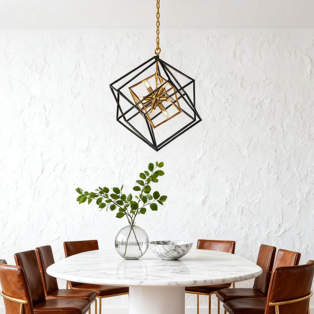
A Black-Dominant Geometric Pendant for Pale Kitchens
The nested square pendant below creates a strong black outline with gold inside the frame. Its open structure adds contrast without forming a solid dark block above a pale kitchen.
Graphic Contrast for White and Light-Wood Kitchens
Industrial Dual-Color Iron Square Pendant
Current Page Price: $3,894.99
Best for a large kitchen table, breakfast area, open kitchen, or substantial island where a black architectural frame should sharpen pale cabinetry while gold keeps the result warm.
- The open black-and-gold iron structure adds contrast without a solid shade.
- Transparent acrylic components soften the visible candle-style light.
- The hardwired 110V fixture uses replaceable bulbs, which are not included.
White Oak, Walnut, and Wood Kitchens
White Oak Benefits From a Black Outer Frame
White oak already provides warmth, so a black-dominant pendant prevents an all-beige effect. Small gold details can echo the grain.
Walnut Can Support a More Balanced Fixture
Walnut supports both finishes, but cream walls or pale counters keep dark wood, black metal, and gold from becoming dense.
Red or Cherry-Toned Wood Needs Quieter Gold
Red-toned wood and polished gold can compete. Satin or aged gold feels calmer, while black creates separation.
Repeat the Wood-Gold Connection Through Texture
Leather, linen, woven textures, warm stone, and ceramics can reinforce warmth without adding more metallic gold.
Wood Already Supplies Warmth
Use black to create definition, then let gold appear as a smaller reflective accent rather than repeating it across every cabinet door.

Black, Navy, and Green Kitchens
Black and Charcoal Need Reflective Separation
Over a black island, use visible gold, open sides, and pale quartz or warm wood nearby so the center does not become a dark block.
Navy Makes Gold Feel Sophisticated
Navy creates cool depth while gold adds warmth. Black interior details connect the fixture to appliances or window frames.
Forest Green Works With Aged or Satin Gold
Deep green pairs naturally with aged gold, oak, and cream stone. Use black sparingly to keep the combination modern.
Two-Tone Kitchens Need One Clear Bridge
In two-tone kitchens, let black relate to the darker island and gold relate to warm hardware or wood flooring.
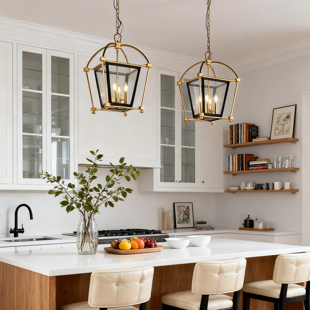
A Gold-Dominant Lantern for Darker Kitchen Colors
This lantern’s gold outer structure remains visible against black, navy, green, and walnut, while the black interior keeps it grounded.
Visible Warmth Over Dark Islands and Colored Cabinetry
Gold Lantern Pendant Light Industrial Stylish Iron Ceiling Light
Current Page Price: $2,994.99
Best for a black, charcoal, navy, forest-green, or walnut kitchen where the fixture needs to brighten the palette and still connect to dark architectural details.
- The black-and-gold iron frame gives the lantern a clear two-tone hierarchy.
- Acrylic shade components help soften the candle-style light.
- The 110V hardwired fixture uses replaceable bulbs, which are not included.
Gray, Greige, and Taupe Kitchens
Warm Gray and Greige Are Natural Bridges
Greige, mushroom, and taupe contain enough warmth for gold and enough gray for black, making them easy open-plan partners.
Cool Gray Needs Warm Support
In an icy gray kitchen, add warm white walls, wood stools, cream tile, or warm bulbs to soften the contrast.
Charcoal Works Better With Gold-Dominant Fixtures
Charcoal behaves more like black than medium gray. Use visible gold, pale counters, and an open frame.
Countertops and Backsplashes That Work Best
White Quartz and Marble-Look Stone
Light counters keep the fixture fresh. Gray veining reinforces black; beige or gold veining connects to warmth.
Warm Beige Stone, Travertine, and Quartzite
Warm beige stone supports gold naturally. Add a clear black outline through stools, a faucet, or windows.
Black Soapstone and Dark Quartz
Dark counters can absorb a black-heavy pendant. Gold-dominant frames, light backsplashes, and undercabinet lighting restore separation.
White, Cream, and Handmade Tile
Simple cream or white tile keeps the fixture central, while subtle handmade variation adds warmth without competition.
Bold Patterned Backsplashes
With dramatic veining or pattern, choose a simpler pendant and bulb shape. Let one element carry the strongest visual movement.
The article Pendant Light Colors for Kitchens and Living Spaces offers broader finish guidance beyond black and gold.

Hardware and Mixed Metals
Do Not Chase an Exact Gold Match
Cabinet pulls and pendant frames rarely match exactly. Shared warmth and sheen matter more than identical color.
Match the Level of Polish
Satin gold works with brushed brass; aged gold works with antique brass or bronze. Similar sheen creates the strongest connection.
Let Functional Metals Stay Neutral
Stainless appliances, nickel faucets, and chrome details can remain neutral. Repeat decorative black or gold selectively.
Use Black in Thin Architectural Lines
Black windows, stool legs, or one faucet can confirm the pendant without creating a theme. See choosing black pendant lights for every kitchen style.

Coordinate Temperature and Sheen
The finishes do not need to match exactly. They need to look intentionally related from the distance at which the kitchen is normally viewed.
Bulbs, Color Temperature, and Glare
Warm White Helps the Gold Look Intentional
Light around 2700K to 3000K enriches gold and softens black. Cooler light creates a sharper industrial effect.
The Bulb Shape Becomes Part of an Open Fixture
Visible candle bulbs affect the style. Clear filament bulbs sparkle but may glare; frosted bulbs feel quieter near seated eye level.
Layer the Kitchen Lighting
Use undercabinet and ceiling lighting so decorative pendant bulbs do not need excessive brightness.
Confirm Dimming Compatibility
Both featured products use E12 bulbs. Dimming depends on compatible bulbs, controls, and wiring.
Three Realistic Kitchen Color Examples
Warm White Cabinets With White Oak Flooring
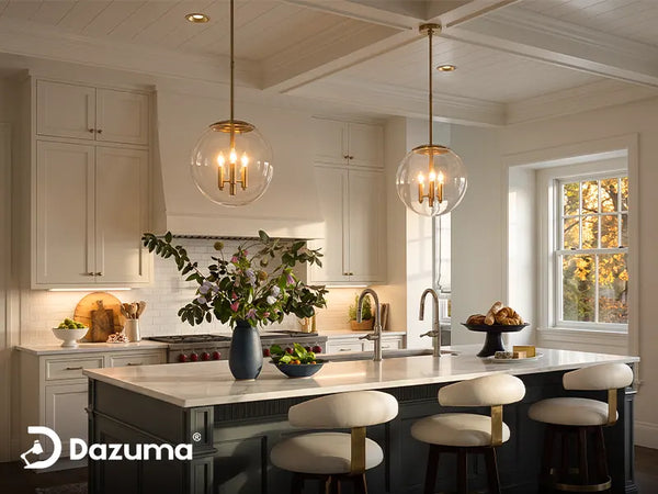
A black-dominant open frame outlines warm white cabinets, connects gold to the oak floor, and keeps the ceiling visually open. Black stool legs provide one subtle repeat.
Navy Island With White Perimeter Cabinets
Gold-dominant lanterns stand out against navy, while black interiors connect to the faucet and windows. White quartz keeps the island light.
Walnut Cabinets With Cream Stone
A balanced fixture gives walnut separation, while cream stone and off-white walls prevent heaviness. Satin gold keeps the room relaxed.
Common Black and Gold Kitchen Color Mistakes
Matching Every Metal Finish
Exact matching often makes a kitchen look packaged. Related warmth and polish are more important than identical color.
Adding Black to Every Available Surface
Black cabinets, backsplash, stools, faucet, windows, and a black-heavy pendant can overload the center of the room. Leave pale or natural surfaces around the fixture.
Using Bright Polished Gold in a Quiet Organic Kitchen
Highly reflective gold may feel glamorous rather than relaxed. Brushed, satin, or aged finishes usually integrate more easily with oak, stone, linen, and handmade tile.
Choosing a Gold-Dominant Fixture for an Already Warm Beige Room
Without a dark outline, the pendant may blend into wood, tan walls, and warm stone. Add black structure through the fixture or nearby architectural details.
Ignoring Daylight Undertones
Cabinet samples can shift from cream to yellow or from gray to blue throughout the day. View the pendant finish beside real samples in morning and afternoon light.
Letting the Pendant Compete With Dramatic Stone
A strongly geometric light and heavily veined backsplash can fight for attention. Simplify one of them.
Using Cool Bulbs With Warm Gold
Very cool light can make gold feel less natural. Use warmer decorative bulbs and let brighter task lighting come from other layers.
Black and Gold Pendant Light Color Checklist
- Decide whether the kitchen needs more contrast or more warmth.
- Choose black-dominant fixtures for pale rooms and gold-dominant fixtures for dark rooms.
- Compare the pendant finish with cabinet samples in natural light.
- Check whether the gold is polished, satin, brushed, or aged.
- Use countertops and backsplashes to create breathing room around the fixture.
- Repeat black and gold selectively rather than on every surface.
- Keep stainless, nickel, or chrome functional metals when they already work.
- Choose visible bulb shapes and output carefully.
- Use warm decorative light and separate task-lighting layers.
- Mock up the full fixture size before ordering a single or pair.
Final Advice: Choose the Kitchen Color First, Then the Pendant Ratio
Warm white and white oak benefit from black structure. Walnut, greige, and taupe support a balanced mix. Black, navy, charcoal, and green usually need more visible gold.
Give the pendant one clear role and support it with only a few related details. Then browse Kitchen Lighting after deciding whether the room needs sharper contrast or more warmth.