
Who This Is For: This guide is for homeowners in the early stages of a remodel who love deep navy, charcoal, forest green, espresso brown, or nearly black walls but are unsure whether a white chandelier will look elegant or simply too stark. If you are choosing paint and lighting at the same time, the goal is not to make every finish match. It is to create enough contrast for the chandelier to feel intentional while keeping the room warm and livable.
Quick Answer: Yes, White Chandeliers Can Look Excellent Against Dark Walls
In fact, dark walls are one of the easiest backgrounds for making a white chandelier feel deliberate. The contrast separates the fixture from the room instead of letting it disappear into a pale ceiling and light walls. A white chandelier can brighten the visual center of a moody room, soften heavy furniture, and keep deep paint colors from feeling overly serious.
The part homeowners often worry about is the contrast becoming too sharp. That can happen, but it is usually not because white and dark colors are incompatible. It happens when the chandelier is too cool in tone, too small for the room, overly glossy, or surrounded by lighting that is much colder than the rest of the interior.
If you are still comparing silhouettes, start with White Chandelier designs and pay attention to material and shape before price or bulb count. White-painted wood, matte metal, translucent petals, glass, and glossy acrylic all behave differently against the same dark wall.

Why White Chandeliers Work So Well With Dark Walls
Dark paint absorbs more light than pale paint, so the edges of furniture and fixtures can visually blend together faster at night. A white chandelier gives the eye a clear reference point overhead. That contrast can make the room feel more layered, not necessarily brighter in a technical sense.
There is also a psychological benefit during remodeling. Many homeowners who commit to a dark room start second-guessing themselves once the first wall is painted. The room suddenly looks smaller and moodier before the furniture, trim, curtains, and lighting return. A lighter fixture can restore visual breathing room without forcing you to repaint the walls.

Think of the Chandelier as a Pause in the Dark Palette
When walls, cabinetry, and upholstery are all deep in tone, one light-colored ceiling fixture gives the eye a place to rest. You do not need to repeat white everywhere. A cream rug, pale artwork mat, white ceiling, or small amount of light wood is usually enough to make the chandelier feel connected.
This is the same reason finish contrast can work in other chandelier choices. The existing guide Black vs Gold Chandeliers: Which Style Fits Your Home? looks at how fixture finish changes the personality of a room. White simply pushes that idea further toward softness and visual relief.
Dark Wall Colors and White Chandelier Pairings
The wall color gives you a starting mood. The chandelier should either reinforce that mood or deliberately soften it.
| Dark Wall Color | White Chandelier Finish | Best Supporting Materials | Overall Effect |
|---|---|---|---|
| Charcoal or Soft Black | Warm matte white or whitewashed wood | Oak, linen, leather, aged brass | Modern but comfortable |
| Deep Navy | Crisp white or softly translucent white | Walnut, nickel, cream textiles | Clean and tailored |
| Forest or Olive Green | Organic white, petal, or wood texture | Natural wood, stone, woven fibers | Soft and nature-inspired |
| Chocolate or Espresso Brown | Creamy white rather than blue-white | Bronze, tan leather, warm stone | Warm and layered |
| Deep Plum or Burgundy | Sculptural white with soft diffusion | Brass, velvet, pale oak | Dramatic without feeling heavy |
Which Kind of White Looks Best?
“White chandelier” sounds like one category, but white finishes can range from chalky and rustic to glossy and futuristic. The material underneath the finish often matters more than the paint itself.
Whitewashed or Painted Wood
Wood keeps white from feeling cold because you still read the grain, rods, or crafted structure. It is a strong choice for dark green, brown, charcoal, or navy rooms with natural textiles. If your home leans organic modern, relaxed transitional, or updated farmhouse, a Wood Chandelier can create contrast without looking sterile.
Matte White Metal
Matte white feels architectural and clean. It works especially well with dark modern walls, black window frames, simple upholstery, and graphic art. Because it has less surface shine, it tends to look calmer than glossy white under strong bulbs.
Translucent or Diffused White
Petal-like PVC, frosted glass, fabric, and other diffusing materials soften the boundary between the fixture and its light. They are useful in bedrooms and living rooms where you want contrast during the day but a gentle glowing form at night.
A Useful Designer Test: View the Fixture With the Lights Off
Early in a remodel, people often evaluate chandeliers only from illuminated product photos. I recommend asking a simpler question: do you still like the shape at noon with the light off? Against a dark wall, the silhouette will be visible all day. If the shape feels too busy without illumination, more bulbs will not solve the problem.

For a Dark Living or Dining Room: Use White Wood to Add Warmth
A common renovation situation is a homeowner who loves charcoal or forest-green paint but already owns a dark dining table and substantial furniture. Adding another dark metal chandelier can make the upper half of the room feel just as heavy as the lower half. A white wood fixture breaks that repetition while still feeling tactile and grounded.
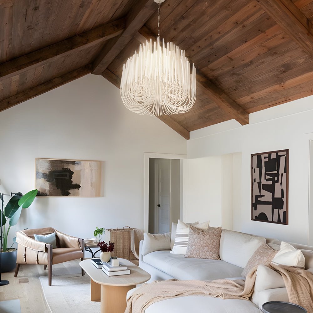
The Organic Stick Chandelier is particularly useful in that situation because the layered wooden rods create a broad silhouette without becoming a solid white disk. The warm 3000K candle-style light also prevents the white finish from shifting visually toward icy blue at night.
Best for Warm Contrast in Larger Rooms
Organic Stick Chandelier White Painted Wooden Ceiling Light
Price: $565.99
Best for dark-wall dining rooms, living rooms, and bedrooms that need a lighter focal point without losing natural texture.
- Four diameter options make it easier to scale the fixture to a compact dining room or a larger living space.
- E14 LED candle bulbs and warm 3000K light reinforce the whitewashed wood rather than making it look cool.
- The fixture is hardwired at 110V and is listed for bedrooms, dining rooms, kitchens, and living rooms.
In a room with deep paint, I would usually pair this type of fixture with at least one other light material below eye level: cream upholstery, a pale rug, limestone, or light oak. You do not need a white sofa and white curtains. One or two supporting notes are enough to make the chandelier feel integrated rather than dropped in from another room.
For a Bedroom or Softer Modern Room: Try a Sculptural White Chandelier
Some homeowners like dark walls because they want the room to feel cocooning, especially in bedrooms. A large branch chandelier may be too energetic there. A soft petal form is a different strategy: the shape is white enough to contrast with the wall, but the translucent, layered appearance keeps that contrast from feeling graphic.
The Hanging Petal Light measures about 20.87 inches wide and uses a 24W integrated LED. It can switch among 3000K, 4500K, and 6000K color temperatures, which is helpful during the decorating phase because you can see how the wall paint behaves under warmer and cooler light. The important limitation is that the fixture changes color temperature but does not dim brightness.
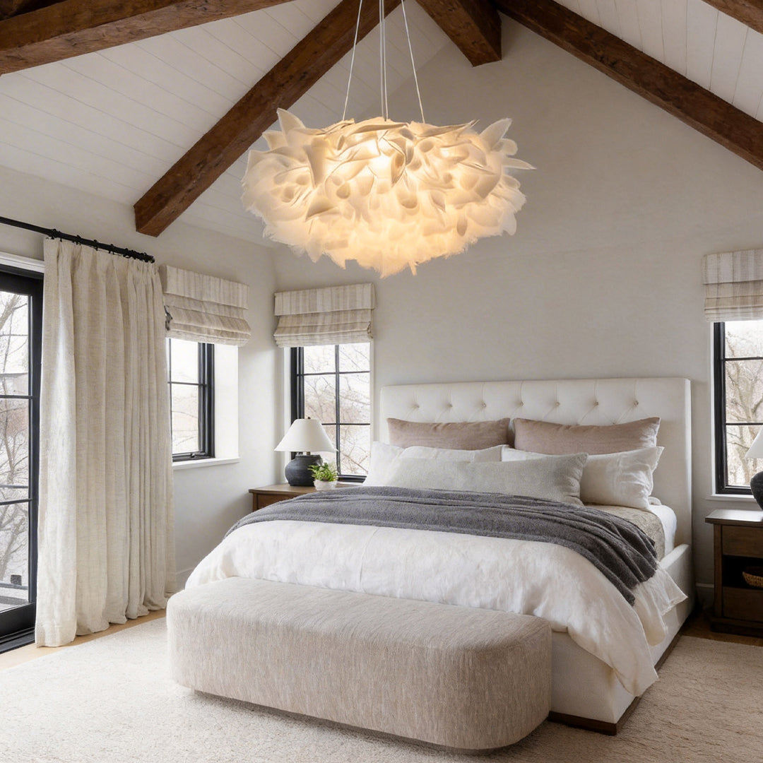
Best for Soft Contemporary Contrast
Hanging Petal Light Modern White LED Slices Pendant Light
Price: $250.99
Best for dark-wall bedrooms, studies, and smaller living rooms where the chandelier should feel sculptural but gentle.
- The layered petal form diffuses the light and creates a softer white focal point than a solid metal shade.
- The product page lists an illumination area of 107–161 square feet.
- The three color settings change color temperature only; brightness is not dimmable.
If you like this softer visual language, the broader Flower Chandelier category is useful for comparing petal, botanical, and floral forms. Dark walls often make these shapes easier to read because each curved edge has a strong background.
Size and Placement Matter More Than Color
A white chandelier can still look wrong against a dark wall when it is undersized. High contrast makes the outline easier to see, which means poor proportion becomes more obvious. A tiny white fixture floating over a large dark dining table can look more accidental than a larger dark fixture that visually connects with the furniture.
Over a Dining Table
Use the tabletop as the main visual anchor. The chandelier should feel clearly narrower than the table and centered over it, while the bottom height should preserve sightlines across the table. In an open layout, center the fixture on the table even if the table itself is not centered in the whole room.
In a Living Room
Use the rug and seating group as the zone. A white chandelier over a dark-wall living room can be wider than many homeowners initially expect because the open space between arms, rods, or petals keeps the fixture from feeling solid. If you are building the whole room rather than replacing one fixture, How to Light a Living Room the Right Way is useful for planning the chandelier alongside lamps and other layers.
Do Not Make the Chandelier Carry the Entire Room
Dark walls absorb light, so homeowners sometimes compensate by choosing an overly bright chandelier. It is usually better to let the chandelier establish the center and add lower-level light near seating, artwork, or shelving. The room feels richer and faces look better than they do under one intense overhead source.
For a cleaner contemporary direction, compare the proportions and open-frame options in Modern Chandeliers. A modern fixture does not have to be minimal, but it should have a silhouette that makes sense with the room's strongest architectural lines.
Choose the Right Light Color for Dark Walls
Paint color is not fixed under every light source. Deep navy can look almost black at night; green can shift toward gray; burgundy can become brownish. That is why I would not choose the chandelier color and bulb color as two unrelated decisions.
3000K Is the Safest Starting Point
For most dark-wall living rooms, dining rooms, and bedrooms, warm white around 3000K is an easy starting point. It softens a white fixture, flatters wood and skin tones, and keeps charcoal or navy walls from feeling overly cool. It is not a rule, but it is a forgiving place to begin.
Use Cooler Settings as a Test, Not Automatically as the Default
A 4500K or 6000K setting can make a crisp contemporary interior feel brighter and sharper, but it also increases the perceived contrast between a white fixture and a dark wall. In a bedroom or intimate dining room, that effect may feel clinical. If the fixture offers selectable color temperature, judge it at night with the actual paint, furniture, and flooring in place.
Pay Attention to Light Reflectance
Designers often talk about a paint's light reflectance value, or LRV. You do not need to memorize the number to use the idea: darker paints return less light to the room, so the same chandelier can feel brighter and more contrasty against them. The practical response is not always a higher-wattage fixture. Adding a table lamp, wall light, or other low-level source can make the room feel more comfortable without blasting the ceiling.

Common Mistakes to Avoid
Matching the Chandelier to the Ceiling and Ignoring the Walls
A white ceiling does not automatically mean every white chandelier will disappear. In a dark room, you see the fixture against walls, curtains, artwork, and furniture from normal eye level. Judge the full room view, not only the ceiling sample.
Choosing Blue-White Light Because the Walls Are Dark
More “white” light does not necessarily make a dark room feel better. It can increase contrast and make the chandelier feel disconnected from warm floors and furniture. Start warm, then move cooler only if the design calls for it.
Making Everything Else White Too
You do not need white trim, white curtains, a white rug, white chairs, and a white chandelier just to make one fixture belong. Repetition should be subtle. Two or three light notes across the room are usually enough.
Buying Before the Paint Is on the Wall
Paint a large sample and view it morning, afternoon, and night. Then compare the chandelier image and dimensions against that background. Dark colors change more dramatically with lighting conditions than most homeowners expect.
Ignoring Installation Access
Decorative chandeliers are hardwired fixtures. Verify ceiling-box support, fixture weight, hanging hardware, ceiling slope, and bulb or driver access before installation. Large or difficult-to-reach fixtures should be installed by a qualified electrician, particularly when the ceiling is high or the existing box was intended only for a lightweight light.
Final Advice
Yes, white chandeliers work with dark walls—and often work better there than against an all-white room. The contrast gives the fixture definition while the light finish prevents a moody palette from becoming visually heavy. The trick is to choose a white that fits the material story of the room.
For charcoal, green, brown, or navy rooms with wood and natural fabrics, the Organic Stick Chandelier brings warmer texture and offers larger size options. For a bedroom, study, or softer contemporary room, the Hanging Petal Light creates a lighter, diffused focal point and gives you three color-temperature settings to test against the wall color.
If you are still early in the renovation, choose the paint and chandelier together, then test the room at night before adding more ceiling brightness. A dark room does not need to be “corrected” with white. It needs contrast in the right places, warmth where people gather, and enough layered light to let the dark walls feel intentional.