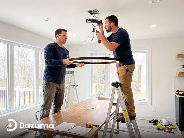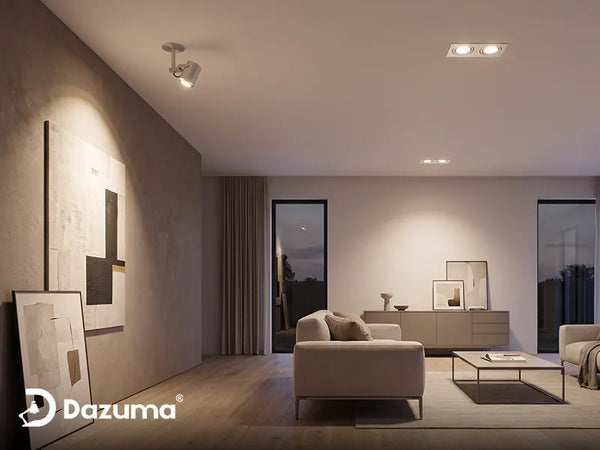

Who This Is For: This guide is for homeowners who are early in a kitchen remodel or lighting update and want to choose a pendant finish that works with white, wood, or black cabinets without making the room feel mismatched, too dark, or overly coordinated.
Why Pendant Light Finishes Cause So Much Second-Guessing
Choosing the shape of a pendant is usually the enjoyable part. Choosing the finish is where many kitchen projects stall. You may have white cabinets, brushed-nickel pulls, a warm wood floor, black window frames, and a faucet that looks somewhere between brass and champagne. Then one pendant is available in black, gold, and chrome, and suddenly every option seems both possible and wrong.
This usually happens because homeowners try to make every visible metal match. Exact matching is rarely necessary and can make a kitchen feel flat. The better goal is visual connection: repeat or complement something already in the room while adding the contrast the kitchen needs.

Quick Answer: Which Pendant Finish Should You Choose?
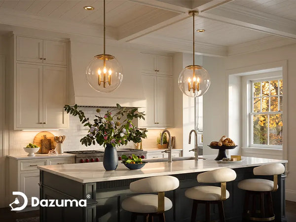
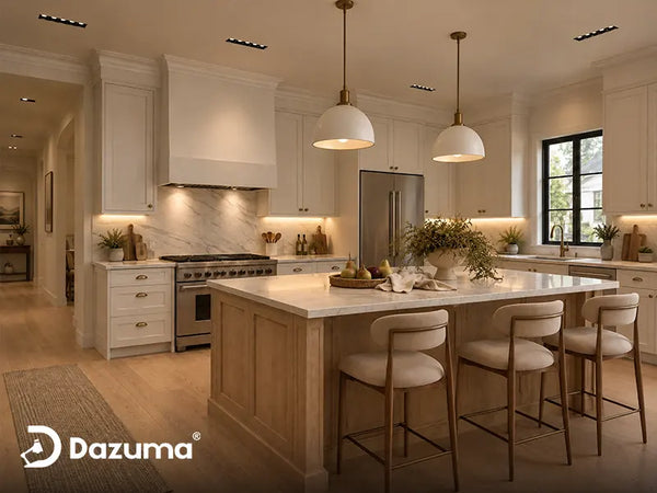
For a white kitchen, black adds definition, warm brass or gold adds warmth, and chrome or polished nickel keeps the room crisp and bright.
For a wood kitchen, black usually provides clean contrast, aged or warm gold works well with warm wood undertones, and chrome is most successful when the kitchen already contains cool gray stone or stainless steel.
For a black kitchen, brass or gold creates warm contrast, chrome or nickel adds a sharp contemporary edge, and black-on-black can look sophisticated when the fixture has a visible silhouette or a light-transmitting material.
If you are still uncertain, choose the finish that repeats at least one other visible element in the room and corrects what the kitchen is missing. A pale room may need contrast. A dark room may need reflection. A cool room may need warmth.
Start With The Finishes You Cannot Easily Change
Cabinet pulls are easy to replace. Stone countertops, flooring, major appliances, and window frames are not. Start with those larger, more permanent surfaces before worrying about a small metal detail.
Look At The Countertop Undertone
Warm white quartz with beige or gold veining tends to welcome brass, bronze, and soft black. Cool stone with blue-gray veining often looks cleaner with chrome, polished nickel, or crisp black. The pendant does not need to copy the countertop; it simply should not fight its undertone.
Notice The Finish Of The Largest Dark Element
Black-framed windows, a dark range hood, a black faucet, or a bank of stainless appliances can act as an anchor. Repeating that anchor in the pendant creates a connection across the room. This is one reason a black fixture often feels natural in a white kitchen even when the cabinet hardware is brass.
Use The Two-Anchor Test
Before approving a finish, identify two places where it visually connects. A black pendant might repeat the window frame and stool legs. A gold pendant might relate to the faucet and warm countertop veining. A chrome pendant might connect to the range and polished cabinet pulls.
The two items do not have to be exact matches. They only need to feel like part of the same finish family. If the pendant has no relationship to anything else, it may look accidental.

Compare Finishes In The Actual Kitchen
Online product photos are useful, but finish color changes under real daylight, cabinet lighting, and warm evening bulbs. Put metal samples or printed finish images near the island and look at them in the morning and after sunset.
How To Choose A Pendant Finish For A White Kitchen
White cabinets are flexible, but flexibility can make the decision feel harder because almost every finish looks acceptable. The question is not what matches white. The question is what the room needs white to become.
Choose Black When The Kitchen Needs Definition
Black pendants outline the island and give a pale kitchen a stronger center, especially when white cabinets, walls, and counters blend together. A slim frame can add definition without making the room dark. Black also bridges stainless appliances and warm hardware well. Browse the Black Pendant Light collection to compare light and visually heavier silhouettes.
Choose Gold Or Brass When The Kitchen Feels Too Cool
A warm metal finish softens bright white cabinetry and works especially well with wood stools, oak floors, beige stone, or cream veining. Gold does not automatically look ornate; shine level and shape matter more. Soft brushed gold on a simple pendant feels quieter than highly polished metal with elaborate detailing. Compare those differences in the Gold Pendant Light collection.
Choose Chrome Or Nickel For A Bright, Clean Look
Chrome and nickel feel visually lighter because they reflect nearby colors. They work well with stainless appliances, gray counters, and glass tile. In an all-white room, balance cool reflective surfaces with wood, woven texture, or warmer bulbs so the kitchen does not feel clinical.
White Cabinets Need Either Contrast Or Warmth
If the room already has black windows and dark stools, a black pendant will feel connected. If the kitchen is almost entirely white and gray, a warm gold finish may create a friendlier evening atmosphere.

How To Choose A Pendant Finish For A Wood Kitchen
Wood cabinets already bring color, grain, and warmth into the room. Your pendant finish should clarify the wood rather than compete with it.
Read The Wood Undertone First
Warm woods usually pair easily with aged brass, bronze, matte black, and soft gold. Ash, white oak, and gray-washed wood can also support nickel or chrome when the countertop is cool. Step back several feet when comparing samples; wood grain changes how a finish reads across the whole room.
Use Black To Give Wood A Modern Edge
Black creates a clean boundary against wood grain. It can make oak feel more contemporary and prevent a warm kitchen from becoming too brown or yellow. Matte or satin black is usually easier to live with than a highly glossy finish because it does not compete with the natural texture of the wood.
Use Warm Metal To Build A Layered, Comfortable Room
Gold, brass, and bronze can make wood feel rich, but choose enough contrast: light oak can support deeper aged brass, while dark walnut can handle brighter brass. If both cabinets and pendants are warm, add black, stainless steel, or pale stone so the room does not become overly blended.
Wood-Finished Pendants Can Work, But Avoid Near-Matches
A wood pendant does not need to match the cabinets exactly. In fact, a slightly different species or stain often looks more intentional than an almost-match. Use the Wood Pendant Lights collection as inspiration for combining natural material with painted or metal details.

Let The Pendant Frame The Wood
A dark pendant can act like punctuation in a wood kitchen. It separates the island from the ceiling visually while allowing the cabinet grain to remain the room’s main material feature.
How To Choose A Pendant Finish For A Black Kitchen
Black cabinetry can look dramatic and calm, but it absorbs more light and carries more visual weight than white or light wood. The pendant finish should either relieve that weight or make the dark palette feel deliberately layered.
Choose Brass Or Gold For Warm Contrast
Warm metal stands out against black cabinets and makes a dark kitchen feel more welcoming, especially with wood flooring or veined stone. Use it selectively; two or three intentional repetitions are usually enough.
Choose Chrome Or Silver For A Contemporary Edge
Chrome and polished nickel reflect light and keep a black kitchen from feeling closed in. They work especially well with stainless appliances, pale stone, and flat-panel cabinetry, and they shift naturally between warm flooring and cool appliance finishes.
Black-On-Black Works When The Silhouette Is Visible
A black pendant can look refined over black cabinetry, but it needs separation. Clear glass, crystal, open metalwork, a pale ceiling, or an illuminated edge keeps it visible. Avoid placing a solid dark fixture directly in front of a dark wall or range hood without a lighter interior or warm illuminated detail.
Dark Kitchens Benefit From Reflection
Clear glass, crystal, polished metal, and softly illuminated edges return light to the room. That can make a black kitchen feel dimensional rather than flat, especially around the island where people gather.

Pendant Finish Comparison For White, Wood, And Black Kitchens
| Kitchen Finish | Reliable Pendant Choices | What The Finish Adds | Watch For |
|---|---|---|---|
| White Cabinets | Black, warm brass, gold, chrome, polished nickel | Contrast, warmth, or a clean reflective look | An all-white-and-chrome room may feel cold without warm materials |
| Light Wood Cabinets | Matte black, aged brass, soft gold, mixed metal | Definition while preserving natural warmth | A near-match wood or yellow metal can make the room feel overly blended |
| Dark Wood Cabinets | Brighter brass, black with glass, chrome, nickel | Contrast, sparkle, and visual lift | Solid dark fixtures may disappear against dark cabinetry |
| Black Cabinets | Gold, brass, chrome, clear glass, black with illuminated detail | Warm contrast or reflected light | Too many heavy black surfaces can make the island feel visually compressed |
Finish is only one part of the decision. Material, shade transparency, and scale change how much visual weight a fixture carries. The guide to pendant light materials can help you compare glass, metal, crystal, wood, and other shade options after choosing a color direction.
A Linear Pendant When You Want Finish Flexibility
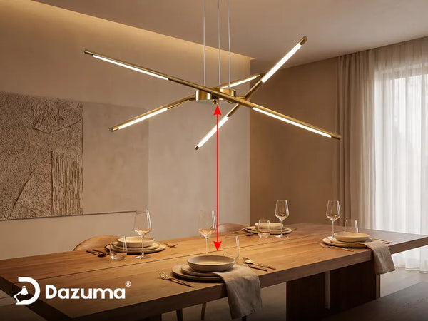
A linear fixture can be useful over a long island because the finish reads as one clear design gesture rather than several separate objects. This is especially helpful in kitchens where the cabinet color is simple but the room contains mixed hardware, appliances, and furniture.
The broader Modern Pendant Lights collection is a practical place to compare how black, gold, chrome, glass, and integrated LED designs change the visual weight over an island.
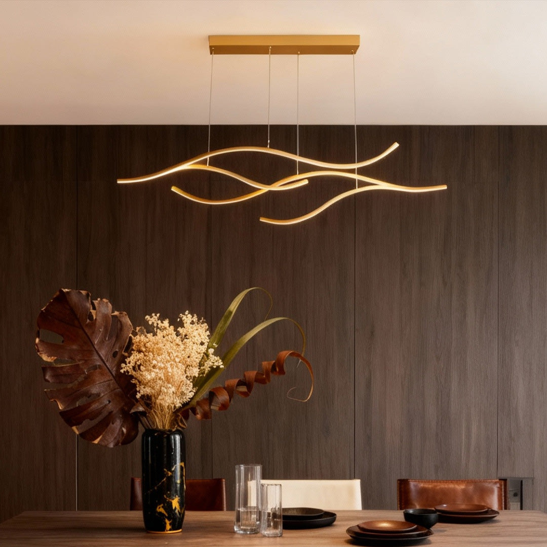
Curved LED Pendant Light Wavy LED Metal Ceiling Light
Price: $292.99
The black, gold, and chrome choices make this linear design useful when you have already selected the shape and proportion but still need to compare how much contrast, warmth, or reflection the kitchen needs.
- Metal frame with a silicone shade creates a soft, continuous light line.
- Available in warm white, white, and adjustable 3000K–6000K versions.
- Adjustable hanging height supports different island and ceiling proportions.
Remember That The Light Changes How The Finish Looks
A finish does not have one permanent color. Brass looks richer under warm light, chrome reflects nearby surfaces, and black becomes more defined when an illuminated edge turns on. Evaluate the finish using the color temperature you plan to use; a combination that feels balanced at noon can look very different under cool evening light. In most homes, warm or neutral-white light keeps food, wood, stone, and skin tones comfortable.

Check The Finish With The Lights On
A pendant is not a static paint sample. Reflective metal changes with daylight, bulb color, and nearby surfaces. Always judge it in the conditions your family will use most often.
A Mini Pendant When You Want To Repeat A Finish Lightly
Smaller pendants let you introduce a finish without creating one large visual block. This can work well in a black kitchen that needs sparkle, a white kitchen that needs a small amount of contrast, or a wood kitchen where you want the cabinet grain to remain dominant.
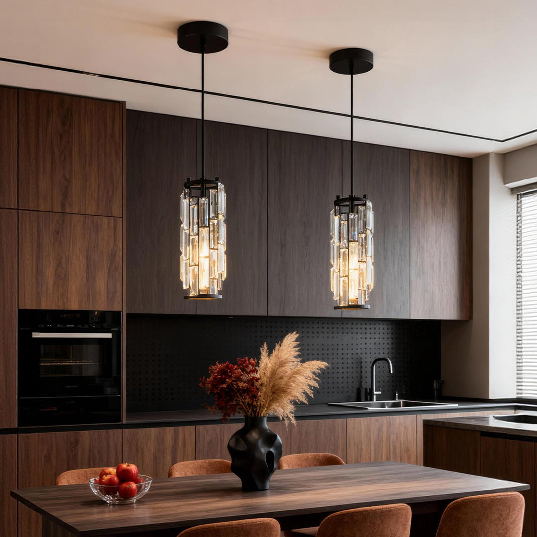
Mini Crystal Pendant Light Creative Art Crystal Island Ceiling Light
Price: $98.99
The narrow profile and reflective crystal-and-glass shade make this fixture useful when you want the finish to appear as a repeated accent rather than a heavy band over the island.
- Available as one fixture or in multi-piece sets for different island lengths.
- Adjustable hanging length supports grouped or evenly spaced layouts.
- Clear reflective material helps the fixture remain visible against dark cabinetry.
Common Pendant Finish Mistakes To Avoid
Trying To Match Every Metal Exactly
Exact matching often fails because manufacturers use different names and undertones. One company’s brushed brass may look yellow beside another company’s champagne bronze. Aim for intentional coordination rather than a perfect color copy.
Ignoring The Fixture’s Visual Weight
A thin black frame and a large solid black dome are technically the same finish, but they do not affect the room the same way. Always consider how much surface area the finish occupies.
Selecting From A Close-Up Product Photo
Close-up images exaggerate texture and shine. Look for room photos that show the entire island and ceiling. The finish should support the kitchen from normal viewing distance, not only look attractive at six inches away.
Introducing A New Finish Only Once
Repeat an unexpected metal somewhere small—a stool frame, faucet detail, shelf bracket, or cabinet knob—so it feels deliberate.
Choosing Finish Before Scale
A perfectly coordinated finish cannot rescue a pendant that is too small, too wide, or hung at the wrong height. Confirm the fixture size and layout before becoming attached to a color. The article on pendant light colors for kitchens and living spaces can help you separate color decisions from proportion and material decisions.
A Simple Finish Checklist Before You Order
- Photograph the kitchen in daylight and with evening lights on.
- List the three largest fixed finishes: cabinets, countertop, and floor or appliances.
- Decide whether the kitchen needs more contrast, warmth, or reflected light.
- Find two existing elements that connect to the pendant finish.
- Compare shine level as well as color: matte, satin, brushed, polished, or antiqued.
- Confirm how much of the fixture is metal versus glass, crystal, or illuminated material.
- Check the pendant size and hanging height before finalizing the finish.
- View a physical sample or product image in the room whenever possible.
Final Advice: Choose The Finish That Solves The Room
A pendant finish should solve a visual need. Black can organize a pale room, gold can warm a cool room, chrome can lighten a dark room, and clear glass can reduce visual weight.
Do not let minor differences between metals delay the project. A kitchen feels cohesive when its major colors, materials, proportions, and light levels work together. The pendant only needs to join that conversation—not repeat every word.