
Who This Is For: This guide is for homeowners who like the drama of black and gold pendant lights but worry that black may feel too severe, gold may look too flashy, or the combination may compete with cabinets, hardware, countertops, and furniture.
Black and Gold Should Create Tension, Not Conflict
Black and gold pendant lights solve two needs at once: black creates an architectural outline, while gold reflects light and adds warmth. Too much black can feel severe; too much bright gold can feel formal or flashy.
Think of the room as having a contrast budget. Decide which finish should lead, then let the other support it instead of repeating both across every surface.

Quick Answer: How Do You Balance Black and Gold Pendant Lights?
Decide whether the room needs more contrast or more warmth. Dark cabinets and black windows usually benefit from a gold-dominant fixture; pale rooms can handle a black-dominant frame with smaller gold accents.
The safest combinations usually follow these rules:
- Repeat black once or twice in thin details, not on every large surface.
- Repeat gold in one nearby metal or warm material, but do not match every finish exactly.
- Use warm white light around 2700K to 3000K to support the gold finish.
- Keep the surrounding cabinet and wall palette quieter than the fixture.
- Choose an open frame when the room has standard ceilings or limited daylight.
- Use pairs only when the island or table is long enough to give each fixture breathing room.
Black should act like punctuation and gold like reflected warmth, not two equally loud statements.
Why Black and Gold Pendant Lights Work Together
Black Gives the Fixture a Readable Shape
In a pale room, black clarifies an open cage, square frame, or lantern without requiring a solid shade. It works well above white islands, light wood tables, and tall entries.
Gold Softens the Severity of Black
Gold catches daylight and electric light, keeping black from feeling cold. Brushed, aged, or satin gold is usually quieter than mirror-polished brass.
The Combination Connects Warm and Cool Materials
Black-and-gold pendants bridge common mixed materials: black connects to architectural details, while gold relates to wood and warm fabrics.
It Can Move Between Styles
A square frame feels modern or industrial; an arched lantern feels transitional. Silhouette, scale, bulbs, and furniture matter more than the finish label.
When comparing broader options, the Black And Gold Pendant Light collection is more useful when you judge the black-to-gold ratio and shape—not just the product label.

Think in Ratios, Not Matching Sets
A small change in how much black or gold is visible can make the same finish combination feel architectural, balanced, or decorative.
Choose the Right Black-to-Gold Ratio
| Finish Balance | Best For | Room Effect | Watch For |
|---|---|---|---|
| Mostly Black, Small Gold Accent | White kitchens, pale walls, modern entries | Graphic and architectural | Too many other black surfaces |
| Balanced Black and Gold | Mixed-metal kitchens and transitional rooms | Polished but approachable | Busy cabinetry or patterned stone |
| Mostly Gold, Black Interior | Dark islands, walnut, cream walls | Warm and decorative | Highly polished gold in small rooms |
| Black Frame, Gold Hardware Only | Minimal homes that need subtle warmth | Controlled and understated | Gold details becoming visually insignificant |
Use Black-Dominant Fixtures to Add Structure
Black-dominant pendants suit washed-out rooms with white cabinets, pale oak, simple walls, and quiet counters. Place gold where light can reach it, such as an inner frame or socket detail.
Use Gold-Dominant Fixtures to Warm Dark or Cool Rooms
Gold-dominant lanterns warm black islands, charcoal cabinets, walnut, and cool gray rooms. A black interior preserves definition and connects to dark hardware.
Do Not Force a Perfect 50/50 Split
A 50/50 split can feel restless. One finish should define the main mass while the other highlights it.
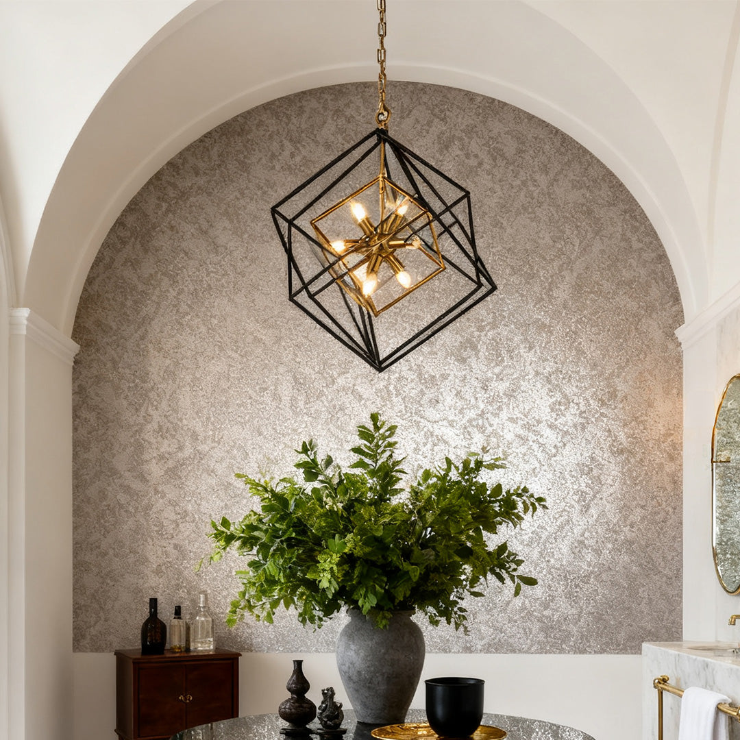
A Black-Dominant Geometric Option for Pale Rooms
An open square pendant creates strong contrast without a solid dark shade. Nested frames outline the room while keeping walls and ceiling visible.
Large-Scale Contrast With an Open View
Industrial Dual-Color Iron Square Pendant
Current Page Price: $3,894.99
Best for a tall entry, stair landing, dining room, or pale open space that needs a strong geometric outline without the weight of an opaque shade.
- The open nested frame preserves wall and ceiling visibility.
- A 1.8-meter adjustable chain supports varied ceiling heights.
- Transparent acrylic elements soften the candle-style light sources.
Other Black Pendant Light designs use the same principle: open silhouettes add contrast without a dark block. See the guide to black pendant lights for different kitchen styles for more shape comparisons.
Repeat Black Thinly and Gold Softly
Black works best when repeated in narrow lines such as cabinet pulls or window frames. Gold can reappear in one faucet, frame, or warm decorative object without becoming a matching set.

Best Cabinet, Wall, Countertop, and Material Pairings
Warm White Cabinets
Warm white gives black a crisp edge while keeping gold warm. Very cool blue-white cabinets can make aged gold look harsher.
Natural White Oak
White oak already supplies warmth, so black-dominant fixtures often work best. Gold connects to the grain while black prevents an all-beige effect.
Walnut and Dark Wood
Walnut pairs with gold, but a black frame adds needed separation. Use lighter walls or stone to prevent visual density.
Black or Charcoal Cabinets
With dark cabinetry, favor a gold-dominant open fixture. Pale counters, clear panels, and warm bulbs keep the center of the room from feeling heavy.
Greige, Taupe, and Mushroom Walls
Greige, taupe, and mushroom bridge black and gold and connect easily to stone, upholstery, and warm gray floors.
White or Light Stone Countertops
Light quartz and marble-look surfaces keep the combination fresh. Gray veining supports black; beige or gold veining supports warmth. Let either dramatic stone or the pendant carry the stronger pattern.
Backsplashes and Wall Tile
White tile, cream stone, pale gray, or restrained vertical tile gives the pendant room to stand out. A black backsplash needs a lighter fixture ratio and good undercabinet lighting.
Mix Metals by Function, Not by Perfect Color Match
A kitchen can comfortably include black pendant frames, brushed brass pulls, stainless appliances, and a dark bronze faucet when each finish has a clear role. Large working elements such as appliances can remain neutral, while decorative finishes repeat more selectively.
Pay attention to sheen as well as color. A satin-gold pendant usually sits more naturally beside brushed brass hardware than beside mirror-polished gold, even when the exact tones differ. Black also varies: matte black feels softer and more architectural, while glossy black creates stronger reflections and may appear more formal.
From normal viewing distance, homeowners notice whether the finishes share a general temperature and level of polish more than whether they are exact manufacturer matches. Place samples together, then step back several feet—the way the room will actually be viewed.
For broader finish comparisons, the article on Pendant Light Colors for Kitchens and Living Spaces explains how fixture color interacts with cabinets, walls, and adjacent rooms.
Match the Pendant Shape to the Room
Square and Geometric Frames
Square frames add architectural order in entries, over square tables, and beside strong window grids. Keep nearby decor simple because corners create extra visual activity.
Lantern Pendants
Gold lanterns with black interiors feel transitional, especially with candle bulbs. Their height and corners need more spacing than small domes.
Round and Dome Pendants
Rounded shapes soften rectangular kitchens. A black exterior with gold interior keeps the outline quiet while reflecting warmth downward.
Linear Fixtures
A linear pendant can replace several individual lights over a long island, creating one controlled line instead of many hanging points.

A Gold-Dominant Lantern Option for Darker Islands
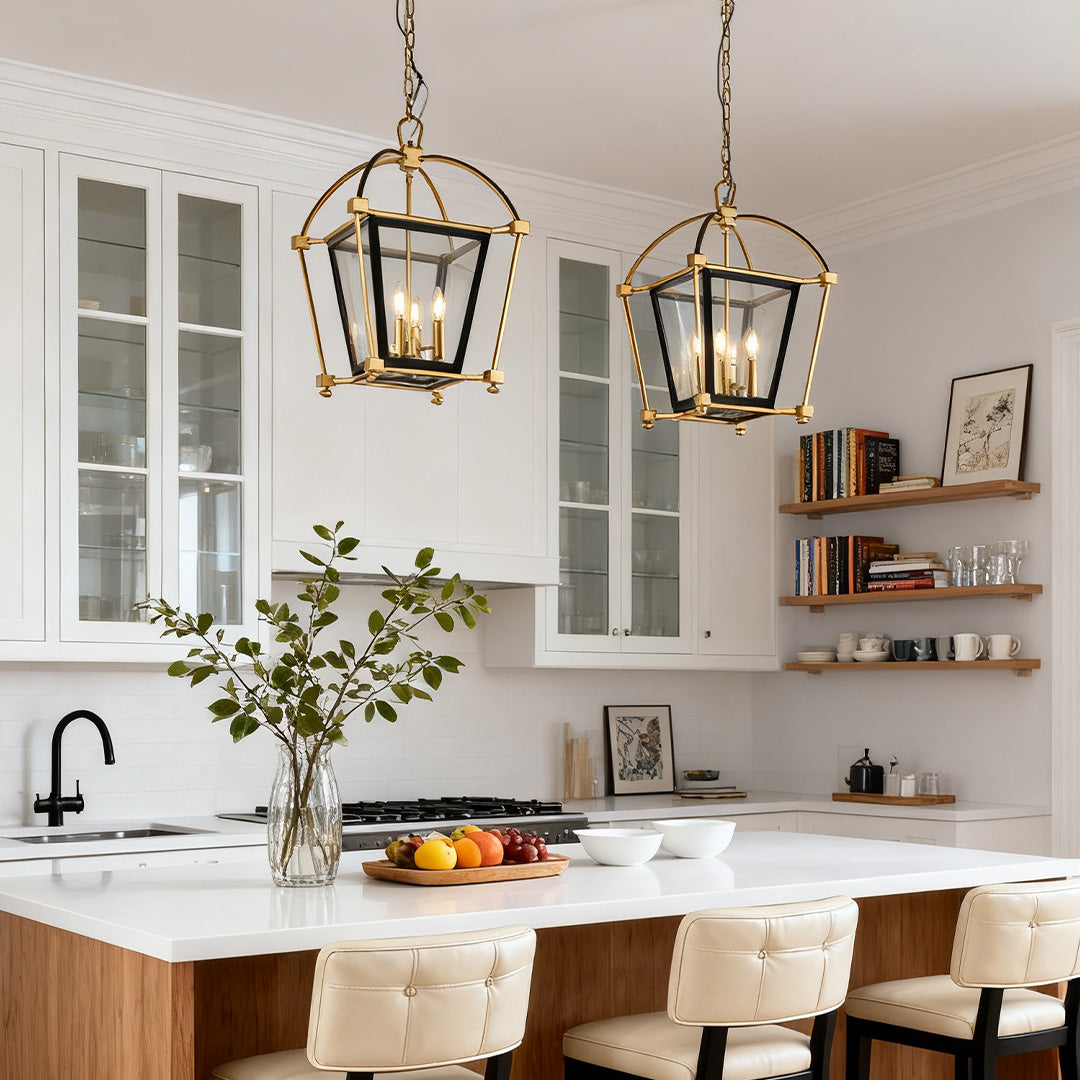
With a black island or dark windows, a gold-dominant lantern adds warmth. Its black interior preserves definition against dark cabinetry.
Warm Lantern Structure With Dark Definition
Gold Lantern Pendant Light Industrial Stylish Iron Ceiling Light
Current Page Price: $2,994.99
Best for a kitchen island, formal dining table, or foyer where gold should provide the main warmth and black should remain a controlled interior accent.
- The gold outer frame stays visible beside dark cabinetry.
- A 1.8-meter adjustable chain supports varied ceiling heights.
- Transparent acrylic panels help soften the candle-style light.
Homeowners who prefer a warmer lead finish can compare more options in Gold Pendant Light, while the Lantern Pendant Light category is useful for comparing frame openness, corner details, and bulb exposure.
Bulbs, Color Temperature, and Glare
Use Warm White to Support the Gold
Light around 2700K to 3000K enriches gold and softens black. Cooler light can flatten satin gold and emphasize an industrial effect.
Choose Bulb Shape as Part of the Design
Open pendants expose the bulb. Clear filament bulbs sparkle but may glare; frosted candle bulbs are often more comfortable near eye level.
Layer the Light
Pendants do not provide complete kitchen coverage. Use undercabinet and ceiling lighting so decorative bulbs can remain comfortable.
Check Dimming Compatibility
Both featured fixtures use E12 bulbs and wall-switch control. Dimming depends on compatible bulbs and controls, which should be confirmed before installation.

The Bulb Can Change the Entire Mood
Open black-and-gold fixtures expose the light source. Frosted bulbs often preserve warmth while reducing the hard sparkle seen from seated eye level.
Scale, Number, and Hanging Height
Judge Visual Weight, Not Only Width
An open 26-inch frame may feel lighter than a smaller solid shade, but its corners create a large visual envelope. Mock up the full width and lowest edge before ordering.
Use One Large Fixture When the Room Needs a Focal Point
One geometric pendant suits foyers, compact tables, or islands where several hanging lines would feel busy.
Use Pairs When the Furniture Is Long Enough
Pairs create rhythm over long islands, but each lantern needs readable space and comfortable clearance from the ends.
Start With Practical Hanging Clearances
Over an island or table, 30 to 36 inches from the surface to the fixture bottom is a common starting point. Adjust for height, glare, and sightlines.
Confirm Structural Support
Large iron pendants require a properly rated ceiling box and secure support. Use a qualified electrician when needed.
A Realistic Kitchen Example
Consider a kitchen with warm white cabinets, a charcoal island, pale quartz, white oak floors, black windows, and brass pulls. The homeowners worry that black-and-gold lanterns will add too many finishes.
The answer is to assign each finish a role. The island and windows carry black; pulls and lantern frames provide restrained gold; stainless appliances remain neutral. Because the island is dark, gold-dominant lanterns feel lighter than black cages. Frosted warm-white bulbs soften the fixtures while undercabinet lights handle tasks.
The room does not need matching black stools, a gold faucet, and gold-framed art. Repetition should confirm the idea, not explain it repeatedly.
Common Black and Gold Pendant Light Mistakes
Matching Every Metal Finish
Perfectly matching faucets, pulls, pendants, and furniture can look packaged. Intentional repetition matters more than identical finishes.
Using Too Much Black at Eye Level and Overhead
Black cabinets, stools, backsplash, and pendant can overload the room’s center. Replace one large dark surface with pale stone, wood, or warm white.
Choosing Bright Polished Gold for a Quiet Room
Mirror-like gold can dominate casual interiors. Satin, brushed, or aged finishes integrate more easily.
Ignoring the Fixture’s Daytime Appearance
Review the frame, finish, panels, chain, canopy, and bulbs in daylight as well as when lit.
Using Clear Bulbs Without Checking Glare
Test seated and standing sightlines; choose frosted bulbs or lower output when necessary.
Installing Too Many Fixtures
Large lanterns and geometric frames need space. A crowded row can feel commercial rather than residential.
Letting the Pendant Carry All the Light
Do not push decorative bulbs to uncomfortable brightness because task or ambient lighting is missing.
Black and Gold Pendant Light Buying Checklist
- Decide whether the room needs more black contrast or more gold warmth.
- Count the room’s existing large black surfaces before adding another one.
- Compare brushed, satin, aged, and polished gold in the actual daylight.
- Match the fixture shape to the table, island, or architectural lines.
- Mock up the full width, height, and lowest edge.
- Check bulb visibility from seated and standing positions.
- Use one or two controlled finish repetitions rather than matching everything.
- Plan task, ambient, and decorative lighting as separate layers.
- Confirm ceiling support, chain length, voltage, and bulb base.
- Review the pendant from adjacent rooms in an open-plan home.
Final Advice: Give Each Finish a Clear Job
Let black define the silhouette and connect to architectural lines. Let gold catch light and relate to wood, fabric, or one nearby metal detail.
Use black-dominant geometry in pale rooms and gold-dominant lanterns beside dark islands or walnut. The strongest result is not perfectly matched; it gives each finish a clear role and repeats warmth lightly.