
Who This Is For: This guide is for homeowners who like the personality of blue pendant lights but worry that a colorful fixture will dominate the kitchen, clash with finishes, or feel difficult to live with after the remodel is complete.
Why Homeowners Hesitate to Use Blue Pendant Lights
Color feels riskier on a ceiling fixture than it does on a pillow or vase. A pendant hangs in the center of the room, appears in nearly every sightline, and is expensive to replace once the electrician has finished. That makes many homeowners retreat to black, white, or clear glass even when the room would benefit from more personality.
The good news is that blue is easier to live with than many bright colors. It can feel tailored, coastal, playful, traditional, or modern depending on the shade and shape. Navy behaves almost like a neutral. Powder blue adds softness. Teal creates energy. Gray-blue can bridge warm wood and cool stone without feeling loud.
The key is not to make everything match the pendant. Treat the fixture as one deliberate color decision, then give it enough quiet space to be noticed without asking every cabinet, chair, rug, and accessory to repeat the same blue.

Quick Answer: How Do You Use Blue Without Overwhelming the Room?
Use one blue pendant or one coordinated group as the room’s main color statement. Keep the largest surrounding surfaces—cabinets, walls, counters, and flooring—relatively calm. Then repeat the blue only once or twice in smaller, less permanent details such as artwork, a runner, ceramics, or a chair fabric.
A practical designer shortcut is one anchor and two echoes. The pendant is the anchor. Two small blue details elsewhere make the choice feel intentional. The echoes do not need to match exactly; a navy pendant can relate to a faded indigo textile and a blue-gray painting.
When the room is small, dark, or already full of pattern, choose a muted blue and a simple silhouette. In a large neutral space, a deeper cobalt, navy, or teal fixture can carry more visual weight.
Why a Blue Pendant Can Feel Stronger Than a Blue Accessory
Pendants sit above eye level, where most rooms have relatively little color. That contrast makes even a medium blue appear more important than the same color on a chair near the floor. A glossy finish also catches windows and ceiling lights, increasing the visual activity.
Shape matters just as much as saturation. A wide solid dome creates a larger block of color than a narrow cone. Three small pendants create repetition, which can make pale blue feel more noticeable than one larger fixture. A rotating or layered shade creates changing shadows and profiles as you move through the room.
Before ordering, make a paper silhouette in the fixture’s real width and tape a blue paint sample to it. View the mockup from the room entrance, nearby hallway, dining table, and living area. This simple test is more useful than judging a tightly cropped product photo.

Color Area Matters More Than the Paint Chip
A soft blue can still dominate when it covers a large solid shade. A stronger blue may feel controlled when used on a narrow fixture with plenty of open space around it.
Choose the Right Shade of Blue for the Mood You Want
Navy Blue: The Safest Long-Term Choice
Navy has enough depth to relate to black hardware, dark window frames, and charcoal upholstery, yet it feels softer and more personal than black. It works especially well with white cabinets, walnut, oak, brass, polished nickel, and warm marble veining.
Powder Blue: Light and Relaxed
Pale blue suits breakfast nooks, bedrooms, coastal interiors, and smaller kitchens where a dark shade would feel heavy. Pair it with warm white rather than icy white so the room does not become washed out. Light oak, cream stone, woven seats, and soft gray are natural partners.
Cobalt or Royal Blue: A Deliberate Focal Point
Saturated blue works best when the surrounding architecture is simple. One cobalt pendant over a round table can look artistic. Five cobalt fixtures in a kitchen with patterned tile, colorful stools, and dramatic veining may become visually exhausting.
Teal and Blue-Green: Rich but Sensitive to Nearby Colors
Teal bridges blue and green, so it pairs beautifully with walnut, aged brass, terracotta, and cream. It can clash with blue-gray cabinets if the undertones are close but not compatible. Compare actual finish samples in the room instead of relying on screen color.
Gray-Blue: Best for a Subtle Color Story
Gray-blue is useful when you want color without a strong coastal or playful message. It coordinates easily with concrete, stainless steel, pale stone, gray upholstery, and weathered wood.
Start with the dedicated Blue Pendant Light collection, then compare the blue finish against real cabinet, countertop, flooring, and fabric samples in both daylight and evening light.
Best Rooms for Blue Pendant Lights
Kitchen Islands
Blue pendants are particularly effective in kitchens because the room usually contains large neutral surfaces. White or cream cabinets create a crisp backdrop, while natural wood cabinets make blue feel warmer and more grounded. With dark blue cabinetry, use blue pendants only when there is enough contrast in tone, sheen, or shape; an almost-match can look accidental.
If the kitchen is visible from the living room, repeat a small amount of blue beyond the island. A painting, a ceramic bowl, or a subtle textile is enough. You do not need a blue sofa or matching accent wall.
Dining Rooms and Breakfast Nooks
A single sculptural blue pendant can define a small round table without requiring colorful walls. Over a long dining table, a wider fixture or two to three smaller pendants can create rhythm. Keep the centerpiece lower and quieter so it does not compete with the ceiling color.
Bedrooms
Small blue pendants can replace bedside lamps and free nightstand space. Muted blue is usually easier to relax around than a bright glossy cobalt. Confirm that the bottom of the shade does not expose a harsh bulb from a reclining position.
Living Rooms and Reading Corners
A pendant over a side table or reading chair can act like suspended sculpture. Directional or adjustable shades are useful when the fixture is meant to support reading, but the room still needs floor or table lamps for balanced evening light.
Home Offices
Blue can feel calm and focused, but the fixture must provide useful light rather than color alone. Avoid placing a glossy shade where it reflects strongly in a computer monitor. A downward beam should land on the desk without leaving the rest of the room gloomy.
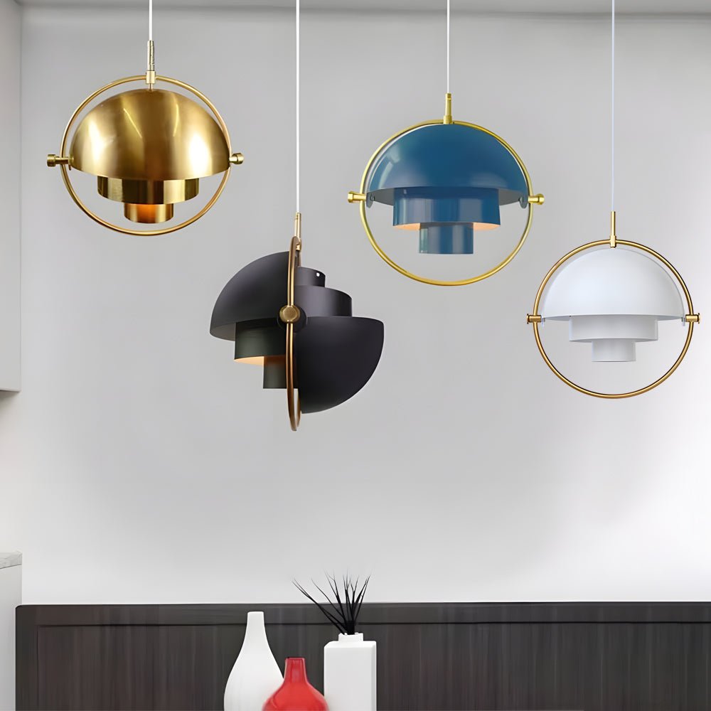
Adjustable Nordic Color Accent
Rotating Shade Electroplated Iron Nordic Pendant Lamp
Price: $202.99
Best for a dining nook, reading corner, bar, or compact island where a blue fixture should feel sculptural rather than bulky.
- The rotating layered shade changes the fixture profile and light direction.
- Iron construction gives the colored finish a clean architectural edge.
- Three diameters make it easier to match a table or small seating zone.
Blue Pendant Light Color and Material Pairing Guide
| Room Finish | Blue That Usually Works | Helpful Pairing | Watch Out For |
|---|---|---|---|
| White or Cream Cabinets | Navy, powder blue, cobalt | Warm brass, oak, marble | Cool white walls that make pale blue feel icy |
| Natural Oak or Walnut | Navy, teal, gray-blue | Cream stone, black details, woven texture | Too many unrelated wood and blue undertones |
| Gray or Concrete | Cobalt, navy, blue-green | Warm wood or aged brass for balance | An entirely cool palette that feels commercial |
| Dark Blue Cabinets | Pale blue or a clearly darker navy | Different sheen, texture, or silhouette | Near-matching blues that look unintentional |
| Colorful Tile or Wallpaper | Muted gray-blue | Simple shade and minimal hardware | Bright blue competing with an active pattern |
For more combinations beyond blue, the guide to Pendant Light Colors for Kitchens and Living Spaces helps compare colored fixtures with common cabinet and furniture finishes.
Repeat Blue Quietly, Not Literally
The pendant can be navy while the supporting accents are faded denim, blue-gray, or patterned ceramics. Variation looks collected; exact matching can feel staged.

Choose the Right Size and Number of Blue Pendants
Color increases visual weight, so a blue fixture may appear larger than a clear glass pendant with the same dimensions. When you are between two sizes, build a paper or cardboard mockup rather than automatically choosing the larger option.
Over a kitchen island, leave enough open counter visible at both ends and enough space between fixtures that each silhouette can be read. Three pendants are not automatically better than two. A pair of medium blue fixtures may feel calmer than three small ones because there are fewer repeated color blocks.
A small pendant can work over a bedside table, compact breakfast nook, or narrow peninsula. Larger dining tables usually need either a wider shade, multiple pendants, or supporting recessed light. Use the principles in The Golden Rules of Pendant Lighting to check height, spacing, and sightlines before finalizing the electrical boxes.
Browse Modern Pendant Lights and the broader Pendant Lighting collection to compare how open frames, slim cones, domes, and layered shades change the amount of visible color.
How Light Color Changes the Way a Blue Shade Feels
A blue fixture does not require cool white light. In fact, warm light often prevents blue metal from feeling clinical. Around 3000K, navy and powder blue tend to feel softer and more residential. Around 4000K, the finish may look cleaner and crisper, which can suit a work area or contemporary interior.
The shade design also matters. An opaque dome sends most of its light downward and leaves the colored exterior visible. An open or adjustable shade may spread light across the ceiling and nearby walls. If the bulb is visible from a seated position, choose a comfortable brightness and consider a frosted bulb or dimmer.
Do not assume the pendant will provide all the kitchen light. Colored metal shades can create excellent task light on the counter while leaving the ceiling and upper cabinets darker. Combine them with appropriate ambient lighting from the wider Kitchen Lighting plan.
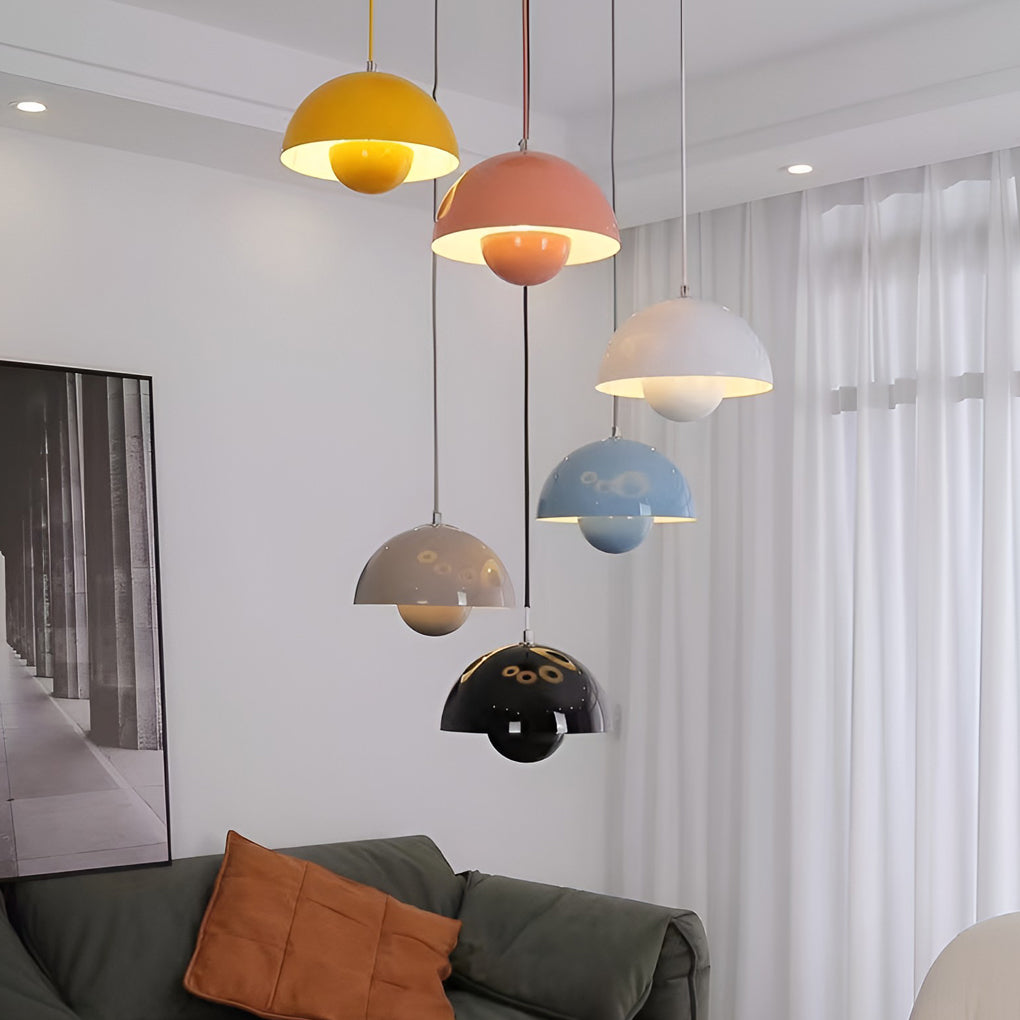
Soft-Glow Mini Color Accent
Metal Dome Pendant Light Nordic Decorative Ceiling Light
Price: $149.99
Best for a small island, breakfast nook, bedside pair, or compact dining table where blue should feel cheerful and controlled.
- The internal shielding cup reflects light and reduces direct bulb glare.
- The compact iron dome can be repeated without creating heavy visual mass.
- Single and multi-light set options support symmetrical layouts.
A Realistic Kitchen Example: When Blue Almost Became Too Much
Imagine a kitchen with white perimeter cabinets, a medium-blue island, brass hardware, oak floors, and a backsplash with blue-gray veining. The homeowners initially choose three glossy navy pendants because each element looks attractive on its own.
Once mocked up, the island, veining, and three dark shades create one large band of blue across the middle of the room. The ceiling fixtures no longer feel special; they make the island visually heavier.
A better solution is either two navy pendants with more breathing room or three smaller powder-blue shades that contrast clearly with the island. The homeowners can also keep the navy pendants and change the island to natural wood, allowing the fixtures to become the single strong blue statement.
This is why color decisions should be made in context. The issue is rarely that blue itself is overwhelming. The problem is too much similar color at the same visual level.

Common Mistakes That Make Blue Pendant Lights Feel Overwhelming
Matching Every Blue Exactly
Exact repetition across cabinets, stools, rugs, art, and pendants can feel themed. Use a family of related blues with different values and textures instead.
Ignoring the Room’s Existing Undertones
A green-leaning teal may fight with violet-blue tile. Compare physical samples under the room’s actual lighting before ordering multiple fixtures.
Choosing a Large Solid Shade for a Low, Dark Room
A deep blue dome can block ceiling views and absorb visual space. A smaller shade, lighter blue, or more open silhouette may feel better.
Using Cool Light Everywhere
Blue shades, cool gray walls, stainless steel, and high-Kelvin bulbs can make a home feel commercial. Add warm wood, cream, brass, or warmer ambient light.
Forgetting the Canopy and Cord
The ceiling canopy, cord, and hardware influence the result. Black creates graphic contrast, brass warms the blue, and a matching blue canopy increases the total color area.
Ordering Before Testing the Number of Fixtures
Repeated blue shapes create stronger rhythm than neutral or transparent pendants. Mock up the full group, not one shade.
Blue Pendant Light Buying Checklist
- Compare the finish with cabinet, countertop, flooring, and wall samples.
- View the color in daylight and under evening lighting.
- Mock up the full shade width and the complete number of pendants.
- Decide whether blue is the room’s main color anchor or a supporting accent.
- Check the shade from seated and standing sightlines.
- Confirm whether the bulb is visible and whether dimming is available.
- Coordinate canopy, cord, and hardware finishes.
- Use one or two smaller blue echoes rather than matching every accessory.
- Confirm hanging height before locating permanent junction boxes.
- Have hardwired fixtures installed by a qualified electrician.
Final Advice: Let Blue Be the Point, Not the Whole Story
Blue pendant lights are most successful when they add something the room is missing: depth in a white kitchen, softness in a gray room, contrast against warm wood, or personality in a simple breakfast nook.
Choose the shade of blue according to the room’s size and mood, then control the amount through fixture shape and quantity. Navy can behave like a neutral, powder blue can feel airy, and cobalt can become art—but each needs enough calm space around it.
Use one strong blue anchor, repeat the idea lightly in one or two details, and allow the rest of the materials to support it. The result will feel colorful and personal without making the room feel designed around a single paint chip.