
Who This Is For: This guide is for homeowners choosing bulbs or fixtures during an early remodel who are confused by labels such as warm white, soft white, cool white, bright white, and daylight—and want each room to feel comfortable without looking yellow, blue, dim, or clinical.
Why the Same Room Can Feel Cozy or Uncomfortable
Many homeowners focus on fixture style and treat bulb color as a final detail. Then the new kitchen looks colder than expected, the bedroom feels strangely bright at night, or cream walls suddenly look yellow.
The issue is whether the light supports the room’s materials, purpose, daylight, and time of use. A crisp white light that helps with laundry can feel harsh beside a sofa at 9 p.m. The goal is a connected home with enough clarity in work areas and enough warmth in evening rooms.

Quick Answer: Is Warm White or Cool White Better?
Warm white lighting, usually around 2700K to 3000K, is the safer choice for living rooms, bedrooms, dining rooms, and other spaces used for relaxing. It complements wood, warm metals, cream paint, natural textiles, and most residential evening activities.
Neutral to cool white lighting, often around 3500K to 4100K, is useful where visual clarity matters, such as kitchens, home offices, bathrooms, closets, laundry rooms, and work areas. Very cool “daylight” light around 5000K or higher can be helpful for specific tasks, but it often feels too blue or commercial as the main nighttime light in a home.
For a dependable whole-home starting point, 3000K is flexible. Use 2700K in especially cozy spaces and 3500K where you need a cleaner task-oriented appearance, then add dimming and layered fixtures.
What Warm White and Cool White Really Mean
Use Kelvin Numbers, Not Marketing Names
Color temperature is measured in Kelvin, shown as K. Lower numbers look warmer and more yellow or amber. Higher numbers look cooler, whiter, or more blue. Product names are less reliable because one brand may call 3000K “warm white,” while another calls it “soft white” or “bright warm.”
- 2200K–2700K: very warm, similar to candlelight or dimmed incandescent light
- 2700K–3000K: warm white for comfortable residential interiors
- 3500K–4100K: neutral to cool white for clearer task visibility
- 5000K–6500K: daylight-like or blue-white appearance
Color Temperature Is Not Brightness
A 5000K bulb is not automatically brighter than a 2700K bulb. Brightness is measured in lumens. A cool white source may feel visually sharper, but two lamps can have the same lumen output and very different color temperatures.
When a room feels dim, a cooler bulb may make it harsher without fixing dark corners. More lumens, better placement, or an additional lamp is often the real solution.
Color Rendering Is a Separate Specification
Color rendering describes how naturally colors appear under a light source. A high-quality 3000K lamp can make skin, food, wood, and artwork look more accurate than a poor-quality 4000K lamp. When color matters, look for a high CRI—commonly 90 or above—rather than choosing by Kelvin alone.
The earlier guide on how to choose the right LED lighting product color temperature provides a useful foundation when comparing product labels.

Test the Actual Materials
A Kelvin number is helpful, but your flooring, paint, stone, and fabrics decide how the light will feel. Test samples after sunset, not only beside a bright showroom window.
Warm White vs Cool White: Room-by-Room Guide
| Room | Useful Starting Range | Why It Works | Watch For |
|---|---|---|---|
| Living Room | 2700K–3000K | Comfortable for conversation, television, and evening relaxation | One bright ceiling light can still create glare |
| Bedroom | 2200K–3000K | Supports a softer nighttime atmosphere | Cool bedside light can feel alerting and visually harsh |
| Dining Room | 2700K–3000K | Flatters food, wood, warm metals, and faces | Very yellow light may distort cool paint colors |
| Kitchen | 3000K–3500K | Balances comfortable ambient light with task clarity | Mismatched under-cabinet and ceiling colors |
| Bathroom | 3000K–4000K | Provides clearer grooming light while remaining residential | High Kelvin alone does not guarantee accurate skin tones |
| Home Office | 3500K–4000K | Creates a cleaner daytime work environment | Use warmer lamps after work if the room is shared |
| Laundry / Utility | 3500K–4000K | Helps with sorting, stains, and detailed tasks | Avoid excessive glare on glossy white surfaces |
Living Rooms and Family Rooms
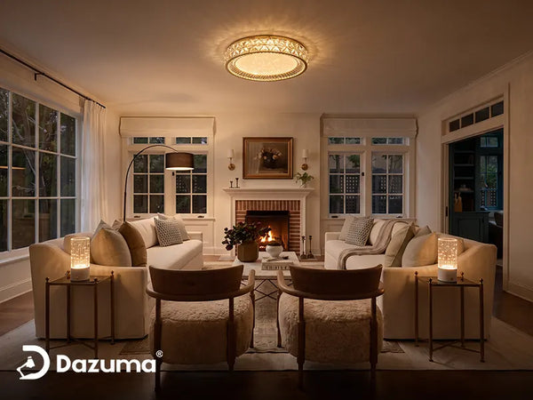
Use 2700K or 3000K as the main evening color. Layer a ceiling fixture with Floor Lamps beside seating and smaller sources that reduce contrast between a bright center and dark perimeter.
Bedrooms
A 2700K ceiling light with warmer bedside lamps creates flexibility. Very warm 2200K–2400K accent light can be pleasant before sleep but may not provide enough clarity for dressing or cleaning.
Browse Table Lamps by shade style and light direction, not only by appearance. The shade can soften a light that would otherwise feel intense. For a deeper bedside decision, see How To Choose Table Lamp Color Temperature: A Designer's Guide.
Kitchens
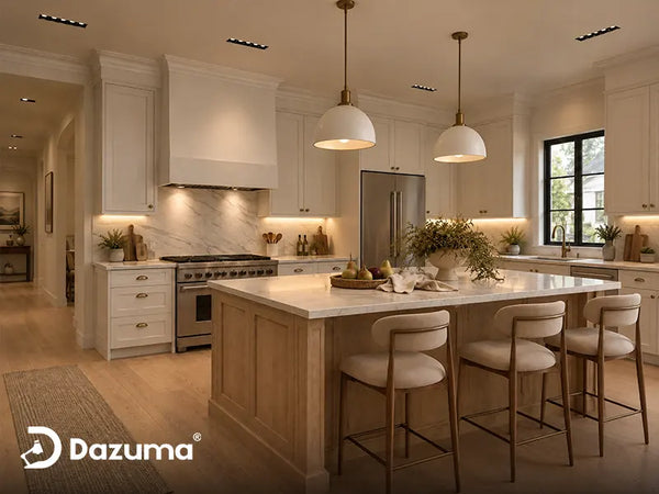
Most kitchens feel comfortable around 3000K, while 3500K can suit cool stone, stainless appliances, and limited daylight. A 2700K pendant beside 5000K under-cabinet strips can divide the room into yellow and blue zones.
When comparing Kitchen Lighting, check whether integrated LEDs and replacement bulbs are available in compatible color temperatures.
Bathrooms
Use 3000K ambient light for comfort and 3500K–4000K high-CRI light at the mirror for grooming. Side lighting is usually more flattering than one cool ceiling light that creates facial shadows.
Home Offices
Neutral white around 3500K–4000K suits daytime work. If the office serves another purpose at night, add a warm lamp or tunable-white fixture instead of making every source cool.
Match the Light to the Activity
A kitchen can use slightly clearer task light while the nearby dining area remains warm. The transition should feel intentional rather than like two unrelated homes.

How Paint, Wood, Stone, and Metal Change the Result
Warm Materials Usually Welcome Warm Light
Oak, walnut, terracotta, cream upholstery, brass, bronze, and beige stone generally look comfortable under 2700K–3000K. Cooler light can make warm materials appear flatter or slightly gray, especially at night.
Cool Materials Can Support Neutral White
Blue-gray paint, white marble with cool veining, chrome, concrete, and stainless steel may look crisp under 3000K–4000K. This does not mean you must use cool white. A warm lamp can create welcome contrast in a gray room, while neutral ceiling light preserves clarity.
White Paint Is Not Truly Neutral
Some whites contain cream or yellow undertones; others lean blue, green, or gray. A warm bulb can make a cool white wall look dull, while a 5000K bulb can make warm white paint look dirty. Paint a sample board and view it under the exact fixture before committing to every bulb in the house.
Dark Rooms Do Not Automatically Need Cool Light
Cooler light may feel sharper, but a dark room usually needs better light distribution and sufficient lumens. Use more than one source, brighten vertical surfaces, and reduce glare. Browse Ceiling Lights together with lamps and wall lighting rather than expecting one fixture to solve the whole room.

Should Home Lighting Change Throughout the Day?
A home office or kitchen may feel comfortable at 3500K–4000K while daylight is present, then feel intense after sunset. Dimmers and tunable-white products can provide neutral light for cleaning or work, then shift warmer and dimmer for dinner and relaxation.
Remember that intensity matters along with spectrum. A very bright warm light can still feel stimulating, and a dim cool light can still feel visually uncomfortable. For evening rooms, reduce both brightness and the amount of cool, blue-rich light where practical.

One Room May Need Two Personalities
A home office can support concentration during the day and still feel comfortable after work. Dimming, a second lamp, or tunable white is often better than one permanent compromise.
Can You Mix Warm White and Cool White in One Home?
Yes, when the change follows room function. A 3000K kitchen beside a 2700K dining room can feel natural; a 5000K kitchen beside a 2200K dining room creates a much stronger color boundary.
Keep Shared Sightlines Close
In open-plan spaces, try to stay within about 500K to 1000K between adjacent ambient sources. Larger differences can still work for hidden task lights, but avoid having yellow and blue fixtures visible together at equal brightness.
Match Fixtures That Perform the Same Job
Recessed lights across one ceiling should generally share a color temperature. Matching sconces on either side of a fireplace should also match. Variation is easier to understand when it separates task, accent, and ambient lighting.
Use Layering Instead of One Compromise Bulb
A living room does not need 4000K overhead light simply because someone occasionally reads there. Use warm ambient light, then add a focused reading lamp with enough output and good color rendering. The article What Is The 3 Lighting Rule? A Designer's Guide To Layered Lighting explains how ambient, task, and accent light can share the same room.
A Realistic Example: The Renovation That Looked Too Blue
Consider an open kitchen, dining room, and family room with white cabinets, pale quartz, and natural oak floors. During construction, 5000K recessed lights are installed everywhere because they appear bright.
After the furniture arrives, the oak floor looks washed out, the family room feels like a work area, and the dining table never feels inviting. The homeowner assumes the fixtures are too bright and starts removing bulbs.
The better correction is to separate the needs: dimmable 2700K–3000K in the family and dining areas, plus 3000K ambient and targeted under-cabinet light in the kitchen.
This is a common lesson: a brighter-looking color temperature does not replace a thoughtful lighting layout. The right combination of lumens, placement, diffusion, color rendering, and Kelvin creates comfort.
Fix the Layout Before Blaming the Kelvin
If counters are dark or corners disappear, you may need better placement and more layers. Changing every bulb to cool white can make the room harsher without solving the shadows.

Common Color Temperature Mistakes
Buying by “Warm” or “Daylight” Labels Alone
Always compare the Kelvin number. Marketing terms are not consistent enough for a whole-home plan.
Using Cool White to Compensate for Low Lumens
If the room is dim, address output, placement, and dark surfaces. A bluer bulb does not automatically provide more light.
Ignoring CRI and Tint
Two 3000K products can render skin and finishes differently. Choose reputable products with good color quality, especially in kitchens, bathrooms, closets, and art-focused rooms.
Mixing Visible Sources Randomly
A warm pendant, blue recessed lights, and greenish under-cabinet strips create visual noise. Coordinate sources that can be seen at the same time.
Testing Only During the Day
Daylight can hide differences. Evaluate samples after sunset with the walls, flooring, cabinets, and furniture in place.
Using One Ceiling Fixture for Every Activity
One light cannot create bright task conditions and relaxing evening atmosphere equally well. Add lamps, sconces, under-cabinet lighting, or dimming.
Color Temperature Checklist Before You Buy
- Write down the Kelvin number instead of relying on color names.
- Separate brightness in lumens from color temperature in Kelvin.
- Choose 2700K–3000K for most relaxation-focused rooms.
- Consider 3000K–4000K for task-heavy rooms and work surfaces.
- Check CRI when skin, food, clothing, artwork, or finishes matter.
- Test bulbs beside the actual paint, wood, stone, and metal.
- Compare the result during daylight and after sunset.
- Coordinate visible fixtures across open-plan sightlines.
- Add dimmers or tunable-white controls where room use changes.
- Buy one sample before ordering every bulb or integrated fixture.
Final Advice: Choose Light for the Way the Room Lives
Warm white is usually the better foundation for evening interiors, while neutral or cool white has a role in kitchens, bathrooms, offices, closets, and utility areas. Consider the time of use, dominant materials, daylight, and whether each source provides ambient, task, or accent light.
For many homes, 3000K is the practical middle ground, with 2700K in the coziest rooms and 3500K–4000K in selected work areas. Test before buying in bulk, keep adjacent sources coordinated, and remember that a comfortable room depends on placement, brightness, diffusion, and color rendering—not Kelvin alone.