Who This Is For: This guide is for homeowners, designers, and remodelers who know they want pendant lighting but feel unsure about color. It is especially useful if you are choosing fixtures for a kitchen island, dining table, breakfast nook, open living space, or a room where the pendant color needs to work with cabinets, hardware, furniture, flooring, and wall paint.
Introduction: Pendant Color Does More Than Match The Room
Choosing pendant light colors sounds simple until the fixture is hanging in your room. A black pendant that looked crisp online may feel too heavy over a small island. A gold pendant may look warm and elegant in the morning but overly yellow at night. A blue or green pendant can be beautiful, but only if it supports the rest of the palette instead of competing with it.
A useful way to think about pendant lighting is this: the fixture color controls the silhouette, while the bulb color controls the mood. You need both to work together. For a deeper look at hanging height and sightlines, especially over islands, you can also reference Pendant Lighting Height Over Kitchen Island: The Ultimate Guide after you narrow your finish options.

Quick Answer: How To Choose Pendant Light Colors
Start with the room’s fixed finishes: cabinets, countertops, floors, dining table, sofa legs, door hardware, and faucets. Then decide whether the pendant should blend in, create contrast, or introduce an accent color. In most homes, pendant lights look best when they repeat at least one material or undertone already in the room.
For kitchens, black, brass, chrome, clear glass, and soft white are the safest colors because they work with common appliance and cabinet finishes. For dining rooms, gold, bronze, smoked glass, black, and warm metallic finishes often feel more inviting. For living spaces, softer finishes such as brushed gold, matte black, wood tones, green glass, blue ceramic, or clear glass can add personality without overwhelming the room.
Here is the shortcut: choose black for contrast and structure, gold for warmth and elegance, chrome or silver for a clean modern look, blue for a cool decorative accent, and green for a natural or organic note. If the room already has several colors, choose a quieter finish. If the room is very neutral, the pendant can carry more personality.
Color Finish Is Not The Same As Light Temperature
One mistake I see often is treating fixture color and light color as the same decision. They are related, but they do different jobs. The fixture finish is the visible color of the pendant itself: black, gold, chrome, blue, green, glass, brass, or another material. Color temperature is the warmth or coolness of the light, usually measured in Kelvin.
This matters because the same pendant can look different under different light. A gold finish under a 3000K bulb usually appears warm and rich. Under a cooler 5000K or 6000K setting, that same finish can feel sharper and less cozy. Matte black stays visually stable, but it can appear more graphic in cool light and softer in warm light. Clear glass reflects whatever is around it, so it can pick up nearby cabinet colors, wall tones, or even greenery from the room.
If you are comparing LED settings, read product pages carefully. A 3-color-temperature fixture may let you switch between warm, neutral, and cool light, but that does not always mean it dims. For a broader technical overview, the blog How to Choose the Right LED Lighting Product Color Temperature? is useful when you want to separate finish color from the actual light output.
Designer Tip: Test Finish Samples At Night
Paint, metal, and glass shift after sunset. Before buying multiple pendants, compare the finish against your room under the actual lighting conditions you use at dinner or in the evening. A brushed gold that feels perfect in daylight may become too saturated next to warm under-cabinet lights. A black pendant that feels dramatic online may become too strong in a small room with low ceilings.
Best Pendant Light Colors For Kitchens
Kitchens are the most demanding room for pendant color because they contain many hard finishes. Cabinets, counters, appliances, faucets, backsplash tile, stools, flooring, and cabinet hardware all compete for attention. The pendant color needs to support that mix, not add visual noise.
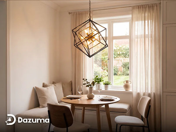
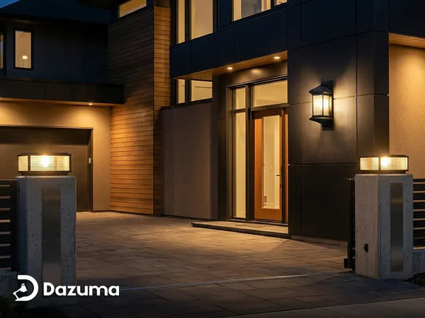
If your kitchen has white or light oak cabinets, a Black Pendant Light creates clean contrast and makes the island feel anchored. Black works especially well when repeated through window frames, barstool legs, cabinet pulls, or a black range hood. The key is repetition. One black element can look random; three black details look intentional.
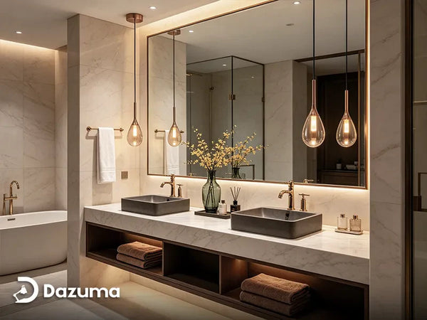
If your kitchen already has warm metals, wood tones, or beige stone, a Gold Pendant Light can bring softness and a sense of polish. Gold is strongest when it is not the only warm finish in the room. Pair it with brass cabinet hardware, warm white countertops, cream walls, or honey-toned wood floors.

Use Black For Shape, Gold For Warmth
Black outlines the pendant and makes the fixture read clearly from across the room. Gold softens that outline and keeps the kitchen from feeling too stark. A Black and Gold Pendant Light is a smart bridge if your kitchen has black stools but warm cabinet hardware.
Match The Undertone, Not Just The Color Name
Not all whites, woods, and metals are the same. A cool white kitchen with gray veining often pairs better with chrome, silver, black, or clear glass. A creamy kitchen with beige stone usually looks better with brass, champagne gold, bronze, rattan, or warm glass. When a pendant feels “off,” the problem is often undertone, not color.
For kitchen-specific fixture ideas beyond finish color, Best Pendant Lights for Kitchen: Top Picks & Styling Tips can help you compare shape, scale, and placement after your palette is clearer.
Best Pendant Light Colors For Dining Rooms
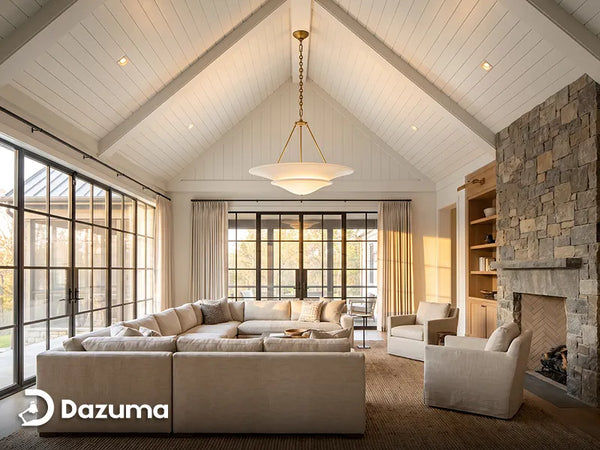
Dining rooms can handle richer pendant colors than kitchens because the fixture usually becomes the visual centerpiece. A dining pendant or chandelier does not need to disappear. It can frame the table, echo the chairs, or introduce a finish that makes the room feel more finished.
Gold, brass, bronze, smoked glass, and black are especially strong dining room choices. Gold and brass feel warm and celebratory, which suits dinner settings. Black adds definition, especially over a wood table. Smoked glass gives you shine without the brightness of clear glass. Chrome and silver can work beautifully in a sleek modern dining room, but they tend to feel cooler and more architectural.
Let The Table Guide The Pendant Color
A dark wood table can support black, bronze, smoked glass, or aged brass. A light oak table often works with soft gold, white, clear glass, or muted green. A marble table can look elegant with polished chrome or glass because those finishes repeat the cool reflective quality of stone.

Choose Contrast Carefully In Smaller Dining Areas
In a compact dining nook, high contrast can either look intentional or crowded. A black pendant over a small round white table can be charming if the fixture is slim. A large dark fixture in a low-ceiling dining area may feel heavy. If you want contrast without weight, try clear glass with black details, smoked glass, or a narrow metal shade instead of a bulky opaque fixture.
Choosing Pendant Colors For Living Spaces
Living spaces need a slightly different approach because pendants are often viewed from multiple angles. In an open floor plan, the pendant may be visible from the sofa, entry, kitchen, and dining area at the same time. That means the color should connect with the whole palette, not just the corner where the fixture hangs.
For neutral living rooms, black can sharpen the space, gold can warm it up, and glass can keep the room visually open. If your living room has plants, natural fibers, or earth tones, a Green Pendant Light can feel organic rather than trendy. If the room uses navy, denim, slate, or cool gray accents, a Blue Pendant Light can add color while still feeling calm.

Use Color As An Accent, Not A Distraction
Blue and green pendants are easiest to use when they repeat something already present: pillows, art, planters, a rug, or a ceramic vase. This makes the fixture feel collected instead of random.
Think About Visual Weight From Across The Room
Visual weight is how heavy a fixture feels to the eye. Matte black has high visual weight. Clear glass has low visual weight. Gold sits in the middle because it reflects light but still reads as a warm metal. Blue and green vary depending on saturation. A pale sage pendant may feel quiet, while a deep emerald shade can become a strong focal point.
A Practical Color Framework
Use this framework before you shop. It keeps the decision practical and prevents a beautiful pendant from fighting the room.
| Pendant Color | Best Room Use | Works Well With | Watch Out For |
|---|---|---|---|
| Matte Black | Kitchen islands, modern dining nooks, open spaces needing definition | White cabinets, black hardware, light oak, industrial details | Can feel heavy in small rooms if the fixture is large or opaque |
| Gold Or Brass | Dining rooms, warm kitchens, transitional living rooms | Cream walls, warm wood, brass pulls, beige stone | Can look too yellow under very warm bulbs or next to cool gray finishes |
| Chrome Or Silver | Modern kitchens, glass-heavy spaces, cool contemporary rooms | Stainless appliances, gray stone, white lacquer, clear glass | May feel cold in rooms with beige, cream, or rustic wood tones |
| Blue | Breakfast nooks, coastal kitchens, calm living corners | White, navy, slate, oak, brushed nickel, blue artwork | Bright blue can feel playful; muted blue is easier for long-term use |
| Green | Organic modern spaces, plant-filled living rooms, relaxed kitchens | Natural wood, linen, brass, stone, indoor plants | Deep green can dominate if the room has no other earthy accents |
| Clear Or Smoked Glass | Small kitchens, dining rooms, open layouts needing lightness | Almost any palette, especially when hardware color is repeated | Requires cleaner bulbs and more visible dust control |

Room-By-Room Color Recommendations
White Kitchen With Stainless Appliances
Choose black, chrome, clear glass, or black-and-gold. Black adds structure, chrome repeats the appliances, and glass keeps the room airy. Gold can work if there are warm pulls, wood stools, or cream veining in the countertop.
Wood Kitchen With Warm Floors
Choose gold, bronze, cream, smoked glass, or muted green. These finishes respect the warmth of wood instead of fighting it. Avoid overly cool chrome unless the kitchen also has stainless details that need to be repeated.
Formal Dining Room
Choose gold, brass, bronze, smoked glass, or black. Dining rooms can handle a richer fixture because the pendant often serves as the centerpiece. If the room has a large table, choose a finish with enough presence to balance the furniture.
Open Living Space
Choose a pendant color that appears elsewhere in the full sightline. If the kitchen uses black hardware and the living area has black picture frames, black pendants will connect the spaces. If the living room has warm wood and brass decor, gold or glass with brass details will feel more natural.
Repeat A Finish At Least Twice
A pendant color looks more intentional when it appears in at least two other places. That could be cabinet hardware, furniture legs, a mirror frame, curtain rods, art frames, or decorative objects.

Common Mistakes When Choosing Pendant Light Colors
Choosing A Color Only From The Product Photo
Product photos are helpful, but they are styled with controlled lighting. Always compare the finish to your own cabinet, counter, flooring, and wall colors.
Ignoring The Ceiling And Sightline
Pendant color is seen against the ceiling first. A black pendant on a white ceiling has strong contrast. A white pendant on a white ceiling feels quieter. A gold or glass pendant may reflect ceiling color. If you want a calm room, lower contrast often works better. If you want a statement, stronger contrast helps.
Mixing Too Many Metals Without A Plan
Mixed metals can look great, but they need a hierarchy. Choose one dominant metal and one supporting metal. For example, black can be the dominant finish with small brass accents, or brass can dominate with black used only in cords, canopy details, and chair legs.
Forgetting Maintenance
Color also affects how much maintenance you notice. Clear glass can show fingerprints and dust. Matte black hides some dust but may show greasy residue in a kitchen. Polished chrome and gold reflect light beautifully but may need more frequent wiping. If the pendant is above a cooking-heavy island, choose finishes that are easy to clean.
Two Pendant Light Styles Worth Considering
Color matters, but shape and material decide how that color feels in the room. These two pendant lights give you two different ways to finish the space: soft and decorative, or clean and architectural.

Soft Decorative Choice
Contemporary Mini Pendant Lights Teardrop Metal Ceiling Light
Price: $96.99
Choose this when you want your pendant light to feel more graceful than graphic. Its slim teardrop shape works well in kitchens and dining areas where hard surfaces need a softer visual detail.
| Finish Options | Black, Chrome, Gold |
| Material | Iron body, acrylic shade |
| Light Source | Included LED, 9W |
| Best For | Slim kitchen islands, dining nooks, café-style counters |

Clean Modern Choice
Glass Round Pendant Light Modern Single-Ball Ceiling Light
Price: $119.99
Choose this when you want a more structured pendant light that feels modern without being too plain. The globe shape keeps the look familiar, while the glass shade keeps the room visually open.
| Finish Options | Gold, Silver |
| Material | Iron body, glass shade |
| Bulb Base | E26 / E27 |
| Best For | Dining rooms, living rooms, home offices, open kitchens |
Final Advice Before You Buy
When you are choosing pendant light colors, do not start with the fixture alone. Look at what already has staying power: cabinets, floors, countertops, dining table, sofa, art, and hardware. Then decide what job the pendant color should do.
Black is dependable when you need structure. Gold is excellent when a room needs warmth. Chrome and silver keep things crisp. Glass adds lightness. Blue and green can be beautiful when they are treated as part of the larger palette rather than a random splash of color.
The safest final check is to repeat the pendant color somewhere else in the room and choose a bulb temperature that supports the finish. Do that, and your pendant lights will look chosen, not just installed.