
Who This Is For: This guide is for homeowners who like the clean look of white kitchen cabinets but feel stuck when choosing pendant light colors. Maybe the island feels unfinished, or you are afraid that black will look too harsh, gold too flashy, and white too invisible. The goal here is not to name one “perfect” color. It is to help you choose the finish that solves your kitchen’s real visual problem.

Quick Answer: The Best Pendant Colors For White Cabinets
The safest and most useful answer is this: black, brass, gold, glass, white, wood, and mixed black-and-gold pendant lights can all work with white cabinets. The right choice depends on what your kitchen is missing.
If the room feels too plain, black pendant lights add structure. If the kitchen feels cold, brass or warm gold adds warmth. If the island already has strong veining, dark stools, or patterned tile, clear glass or white glass keeps the view lighter. If you have black cabinet pulls, a black range hood, black window frames, or dark counter stools, black pendant lights usually feel intentional instead of random.
For many white kitchens, the strongest choice is not a single flat color. It is a balanced finish: black with brass, black with white glass, aged brass with a pale shade, or clear glass with a dark canopy. That kind of pendant repeats existing kitchen details without making the island look heavy.
Why White Kitchens Are Surprisingly Hard To Finish
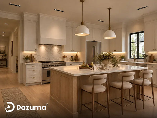
White cabinets seem easy because they go with everything. In real homes, that is exactly the problem. When everything can work, it becomes hard to tell what actually looks right. A white kitchen can look fresh in daylight but washed out at night, especially when the cabinets, walls, backsplash, and ceiling are all close in value.
Pendant lights over the island sit near eye level, so they are not background details like cabinet hinges. A pendant does three jobs at once: it lights the island, anchors the empty air above the counter, and tells the kitchen what style direction it is taking.
A practical rule is to look for the missing ingredient. A cool white kitchen with gray counters often needs warmth. A white kitchen with oak floors may need a dark outline. A small kitchen may need glass. A large open kitchen may need a bolder pendant because tiny fixtures can look like dots over the island.

Start With What Already Exists
Before choosing a pendant color, list the fixed finishes: cabinet hardware, faucet, appliances, counter veining, floor tone, stools, range hood, and nearby dining light. The best pendant color usually repeats one detail or adds what the room lacks.
Pendant Light Color Comparison
Here is a simple way to narrow the decision. This table is not about trends. It is about the visual problem each finish solves in a real white kitchen.
| Pendant Color Or Finish | Best For | Watch Out For |
|---|---|---|
| Matte Black | Adding contrast, matching black pulls, grounding a bright kitchen | Can feel heavy if the shade is oversized or the ceiling is low |
| Brass Or Warm Gold | Warming up cool white cabinets, marble, and gray floors | Looks best when repeated in faucet, pulls, frames, or decor |
| Clear Glass | Small kitchens, open sightlines, busy backsplash or strong stone veining | Bulb choice matters because the bulb is visible |
| Milk Glass Or White Glass | Softening glare, adding gentle light, keeping the kitchen calm | Needs a contrasting canopy or hardware if the kitchen is all white |
| Wood, Rattan, Or Natural Fiber | Coastal, organic modern, farmhouse, or warm family kitchens | May not suit very polished or high-contrast kitchens |
| Black And Gold | Kitchens that need both definition and warmth | Use carefully in very small rooms; choose lighter shades if needed |
Black Pendant Lights For Crisp Contrast
Black is usually the easiest color to understand with white cabinets because the contrast is immediate. It makes the pendant lights visible, outlines the island, and gives the room a cleaner rhythm. If your kitchen has black drawer pulls, black-framed windows, a black faucet, or dark counter stools, black pendants often make the space feel pulled together.
The real concern is how much black your kitchen can handle. A thin black frame feels lighter than a solid black dome. A black canopy with a glass shade feels softer than a fully opaque shade. In a large kitchen with a long island, a stronger black shape can stop the space from feeling blank.
Black also works well with white counters and gray veining. The pendant helps the eye move from the stone to the hardware to the fixture instead of seeing one large field of white. For more general kitchen fixture styling, the guide Best Pendant Lights for Kitchen: Top Picks & Styling Tips is a useful companion when you are comparing shape, size, and placement.
A Softer Black Option For White Cabinets
If you like black contrast but do not want the kitchen to feel severe, a black pendant with a white glass globe is often easier to live with than a solid black shade. The black hardware repeats the darker details, while the white glass keeps the light softer and visually connected to the cabinets.
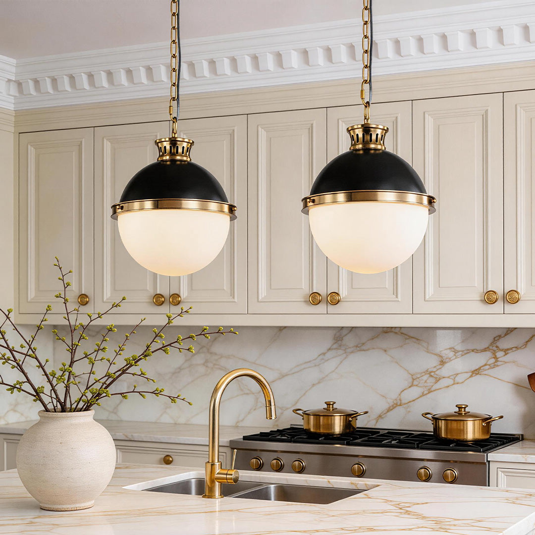
Soft contrast for white kitchens
Ball Pendant Light With A Classic Glass Globe
Price: $1,871.99
This works well when white cabinets need a darker accent, but you still want a gentle globe shade instead of a heavy metal dome.
- Black hardware gives white cabinetry a clear visual outline.
- Milk-white glass helps diffuse light more softly over the island.
- The 13.7-inch diameter suits kitchens that need presence without an oversized frame.
Gold And Brass Pendant Lights For Warmth
Gold and brass pendants are popular with white cabinets because they fix a common problem: the kitchen looks clean but a little cold. This happens with white shaker cabinets, white subway tile, gray counters, stainless appliances, and cool daylight bulbs.
A warm metal pendant changes that feeling quickly. Brass and soft gold catch light in a way matte black does not. The key is to choose a finish that looks warm rather than overly yellow or shiny. Brushed brass, aged brass, soft gold, or champagne brass usually feels more natural than mirror-like bright gold.
Gold pendants work best when repeated somewhere else. A brass faucet, warm cabinet pulls, gold frame, cutting board, or oak stool leg can make the pendant feel intentional. If you want to browse finish direction before choosing a fixture shape, gold pendant light styles are helpful to compare against white cabinetry, warm wood, and marble surfaces.
Warm Metals Make White Feel Less Clinical
White cabinets plus gray counters can look polished but flat after sunset. A warm metal pendant adds a lived-in note, especially when the kitchen connects to a dining or living space with warmer furniture.

Glass, Milk Glass, And White Shades
Glass is the best answer when you want the pendant lights to look finished without blocking the room. Clear glass keeps sightlines open, which matters in smaller kitchens or open-concept homes. The downside is that clear glass exposes the bulb, so glare or a mismatched color temperature will show.
Milk glass and white glass soften the bulb and create a quieter glow. This is useful if you cook, help kids with homework, or eat casual meals at the island. A white glass globe can connect to white cabinets without becoming invisible when the canopy, chain, or frame has contrast.
For white cabinets, glass pendant lights are often the easiest category to use when you are worried about making a kitchen feel smaller. They add shape and sparkle without the visual weight of a solid metal shade.

Mixed-Finish Pendants For Real Kitchens
Real kitchens are rarely one finish. You might have stainless appliances, black cabinet pulls, a brass faucet, warm wood floors, and a marble-look counter. Mixed-finish pendants bridge the finishes you already own instead of forcing the kitchen into one strict metal color.
Black and gold is a strong example. Black gives definition against white cabinets. Gold adds warmth. Together, they work especially well when the kitchen has black stools but warm floors, or when the hardware is dark but the homeowner wants the room to feel less stark. The same idea applies to black with white glass, brass with clear glass, or bronze with warm woven shades.
The trick is restraint. If the pendant already has two finishes, let it repeat two important notes in the room, then keep smaller accessories simple.
A Bolder Black-And-Gold Option For Large White Kitchens
In a larger kitchen with a wide island or open dining view, a delicate pendant can look under-scaled. A geometric black-and-gold pendant can act more like architecture and give white cabinetry a stronger focal point.
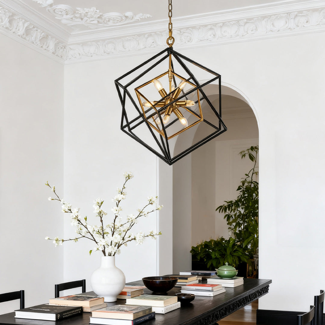
Statement contrast for open kitchens
Square Pendant Lights Industrial Iron Artisan Dual-Color Ceiling Light
Price: $3,894.99
This is better suited to larger islands, open kitchens, or dining-facing layouts where the pendant should be a visible design feature instead of a quiet accent.
- The geometric frame adds structure above a plain white island.
- Black and gold finishes help connect dark accents with warm metal details.
- The 26-inch diameter gives the fixture stronger presence in open spaces.
Real Kitchen Scenarios And What Works
White Cabinets With Black Hardware
Choose black, black-and-glass, or black-and-gold pendants. The pendant should repeat the hardware, but it does not need to match perfectly. A slightly softer black finish usually looks more relaxed than a very glossy black fixture.
White Cabinets With Brass Hardware
Brass, champagne gold, or black-and-brass pendants usually work best. If the room already has a lot of gold, choose glass shades or slim frames so the kitchen does not become too shiny.
White Cabinets With Stainless Steel Appliances
You do not have to choose silver pendants just because the appliances are stainless. Stainless is often a neutral background. Black, glass, and brass can all work, but repeat the chosen finish in at least one other detail.
White Cabinets With Wood Floors
Black pendants create definition, while brass or natural woven pendants connect to the warmth of the floor. For farmhouse or relaxed transitional kitchens, the article Modern Farmhouse Kitchen Lighting Ideas can help you compare warm metals, natural materials, and more casual fixture shapes.
Small White Kitchens
Use clear glass, small black frames, mini pendants, or white glass with a contrasting cap. Avoid oversized dark shades unless the ceiling is high and the island is wide. The goal is to add a finish, not block the view.
Large White Kitchens
Use a stronger shape: large globe pendants, lantern forms, linear pendants, or mixed-finish fixtures. A large white kitchen can make small pendants look accidental. Scale matters as much as color. For a broader size and placement framework, see Pendant Lighting Height Over Kitchen Island.

Let The Kitchen Size Decide The Visual Weight
Color is only half the decision. A small pendant in the right color can still feel wrong if the island is long. A bold pendant in the right finish can look elegant when the room has enough space around it.
Common Mistakes To Avoid
Matching Everything Too Perfectly
A kitchen can look flat when every metal finish is identical. It is fine to mix black pulls with brass pendants or stainless appliances with glass pendants. The important part is repetition. A finish should appear more than once so it feels planned.
Choosing White Pendants Without Any Contrast
White pendants can look beautiful with white cabinets, especially in coastal or minimalist kitchens. But if the cabinets, walls, backsplash, counter, and pendants are all white, the fixture may disappear. Add contrast through a dark cord, warm metal canopy, textured shade, or nearby wood detail.
Ignoring The Bulb Color
A beautiful pendant can still look wrong if the bulb color is too cool. Warm white light often makes white cabinets feel more comfortable at night. Very cool light can make white kitchens feel harsh, especially with gray counters or glossy tile. If you are comparing bulbs, the guide How to Choose the Right LED Lighting Product Color Temperature is a helpful reference.
Forgetting The View From Other Rooms
In open homes, the kitchen pendant is visible from the sofa, dining table, and entry. Do not choose only by standing at the island. Step back into the living area and see whether the pendant color connects to the rest of the home.

Summary: Choose Contrast, Warmth, Or Quiet
The best color pendant lights for white cabinets are the ones that fix what your kitchen is missing. Choose black if the room needs contrast and definition. Choose brass or gold if the kitchen feels too cool. Choose glass if you need openness. Choose milk glass or white glass if you want soft, comfortable light. Choose black-and-gold or another mixed finish when your kitchen already contains more than one metal and you need the pendant to connect them.
White cabinets give you flexibility, but they also expose weak choices quickly. Instead of asking which pendant color is universally best, ask a more useful question: Do I need more contrast, more warmth, more softness, or less visual weight? Once you answer that, the right pendant color becomes much easier to see. You can also compare broader pendant lighting options when you are still deciding between shape, finish, and shade material.